
Infographics build brand awareness in a way a text post never can: they travel. Every time someone shares, embeds, or screenshots your graphic, your colors, your logo, and your way of explaining things land in front of someone who has never heard of you.
The catch is that this only works if your infographics are recognizably yours. Post random template designs and you're building awareness for the template marketplace.
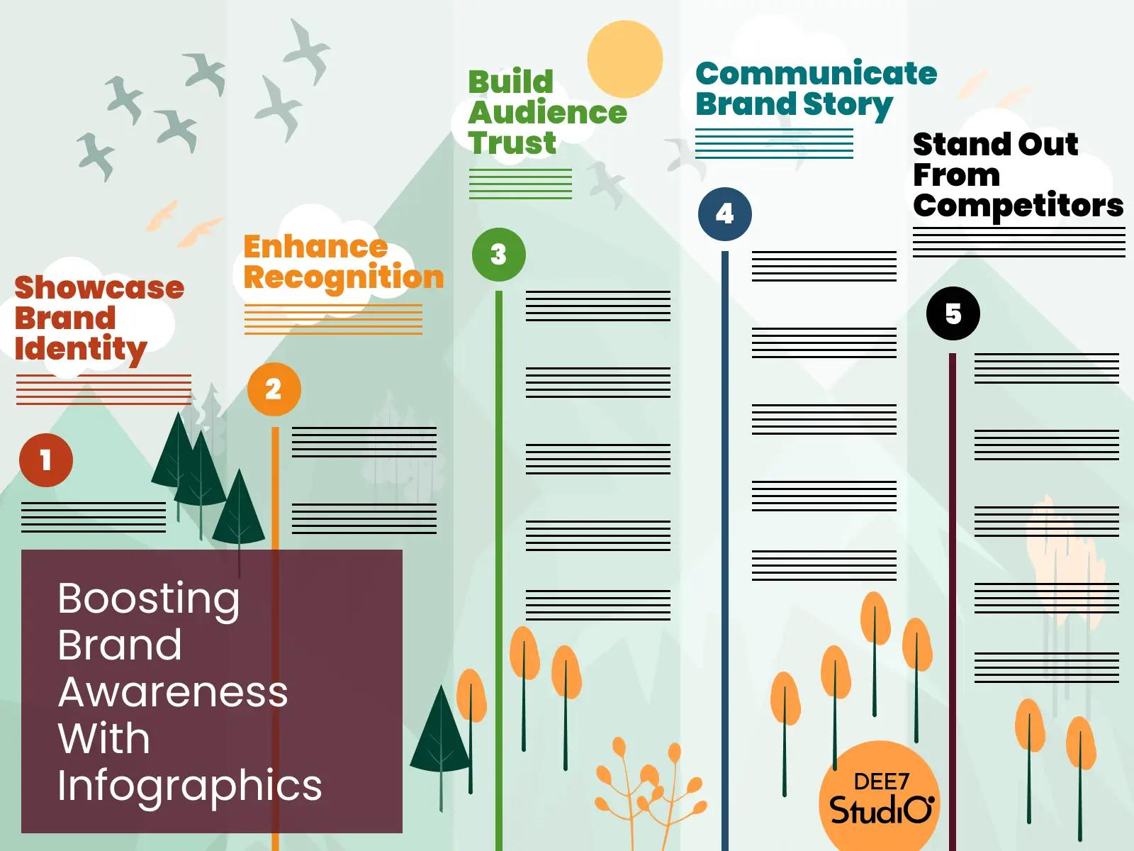
Why visuals carry a brand further than text
People forget most of what they only read or hear, and research on the picture superiority effect shows that pairing information with a relevant image makes it dramatically more likely to be remembered days later. Your brand rides along with that memory.
Think of Spotify Wrapped. Every December, millions of people share the same chart style, and you'd recognize it with the logo cropped out. That's brand awareness built almost entirely from data visuals. Your version can be smaller and still work the same way.
How to make infographics recognizably yours
- Lock the palette and type. Pull colors and fonts straight from your brand system, then never improvise. Recognition is repetition.
- Pick one chart style and keep it. Same bar shapes, same label style, same grid. A consistent chart language becomes a signature faster than a logo does.
- Put your logo and URL in the same corner every time. Small, legible, always there. Screenshots strip captions; they don't strip pixels.
- Add one signature element. A texture, an illustration style, a recurring motif. The thing people describe when they say "it looked like one of yours."
- Build a template. One reusable file means every graphic ships on-brand, even the ones made in a hurry on a Friday.
Where branded infographics compound
Social feeds are the obvious venue, and visuals reliably out-perform plain text there (we cover the tactics in boosting social media engagement with infographics). But the quieter channels matter just as much: your graphics get dropped into other people's slide decks, internal Slack threads, and newsletters. Each one is a tiny branded billboard you didn't pay to place.
The effect is cumulative. One graphic does little. Twenty graphics over a year, all visibly from the same hand, make your brand feel familiar before a prospect ever visits your site. And familiarity is most of what "awareness" means in practice.
One warning before you start
Branding can't rescue an empty graphic. If the content isn't useful, a shared infographic just teaches more people to scroll past your colors. Make something worth keeping first, then dress it in your brand. If you want the full case for the format, our pillar post lists 22 reasons to put infographics to work, and brand awareness is only one of them.