
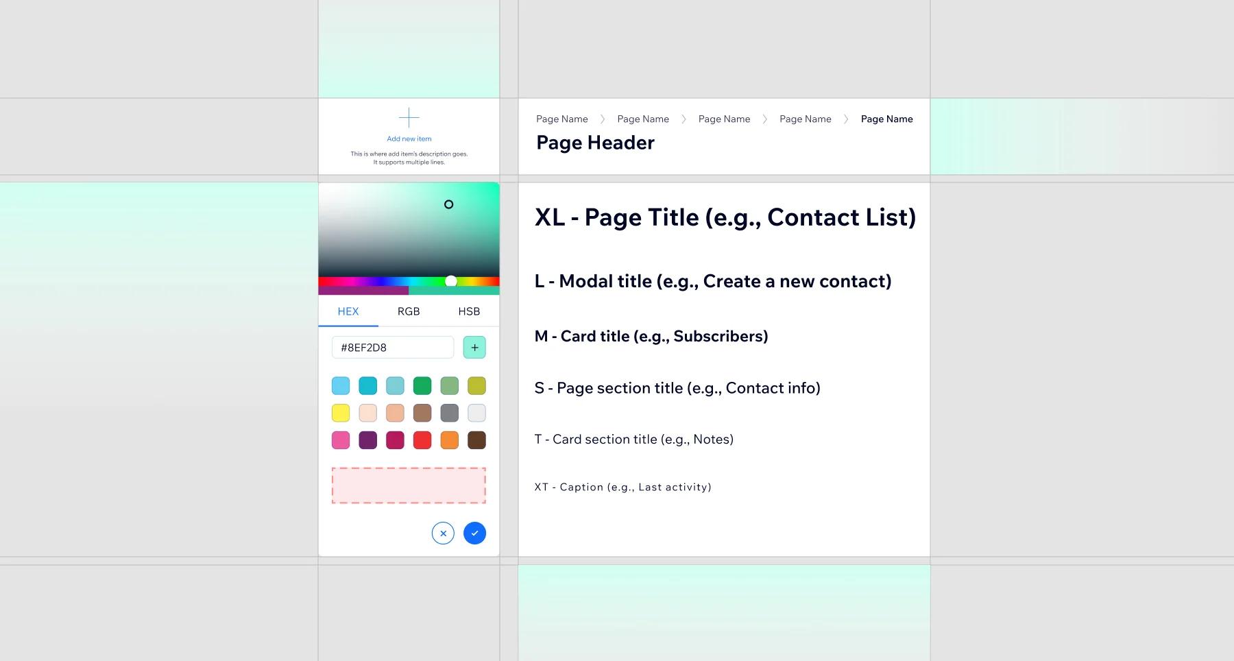
A design system is a single source of truth for how your brand looks and behaves: the colors, type, components, and rules that every page, app screen, and social post draws from. Build one and two things happen fast: your brand stops drifting, and your team stops redesigning the same button every month.
You don't need Google's budget for this. A lean design system in Figma is a few weeks of focused work, and it pays rent every day after.
Does your business need a design system?
If more than one person touches your design, yes. Here's what it buys you.
Brand consistency that survives growth
Without a system, every new hire, freelancer, and rushed deadline nudges your brand a little off-model. Six months later your website, deck, and app look like cousins, not siblings. A design system gives everyone the same source of truth, so consistency stops depending on memory. We've covered why that matters commercially in brand consistency: the trust builder.
Less redundant work
Reusable components mean a card, form, or nav gets designed once and reused everywhere. In our own client work, the biggest win isn't the first build; it's every project after, when "design the pricing page" becomes assembly instead of invention. Teams consistently ship faster once the component library exists.
Fewer designer-developer arguments
Most handoff friction is ambiguity: which grey, what spacing, how does this behave on mobile? A documented system answers those questions before they're asked, so reviews focus on the work instead of relitigating basics.
What makes up a complete design system?
- Brand guide. Mission, values, voice, and how the brand should feel. The "why" behind every visual rule.
- Visual style guide. Exact color values, type scale, spacing units, imagery style. The difference between "our blue" and #1A56DB.
- UI kit. The component library: buttons, forms, cards, navigation, icons, built as reusable Figma components with their states (hover, disabled, error).
- Patterns and principles. How components combine into common layouts, and the rules for interaction, motion, and accessibility.
- Documentation. Usage notes next to the components: when to use each variant, and just as important, when not to.
How do you build a design system? Our 4-step process
This is the process we run at Dee7 Studio, entirely in Figma so designers, developers, and stakeholders work in one file.
Step 1: Discovery and brand audit
Collect everything the brand currently ships: website, decks, ads, emails. Screenshot it side by side. The inconsistencies you find are the to-do list, and stakeholder interviews tell you which ones actually hurt. No design yet; just evidence.
Step 2: Core brand guide
Lock the foundations: brand principles, voice, color palette, and typography. Keep it ruthless. Two typefaces and a disciplined palette beat a "flexible" system nobody can apply correctly.
Step 3: Build the UI kit in Figma
Turn the foundations into components. Start with the elements that appear everywhere (buttons, inputs, cards, nav), build them with variants and auto layout, and define interaction states as you go. Resist building components you merely might need; a system earns trust by covering the common 80 percent well.
Step 4: Documentation and handoff
Write usage guidelines directly into the Figma file, then walk the team through it live. A design system nobody was trained on becomes shelf-ware within a quarter. Assign an owner who approves additions, or the library fills with one-off variants and you're back where you started.
What do good design systems look like?
You don't have to imagine the result. These are the reference points we steal from, plus one of our own.
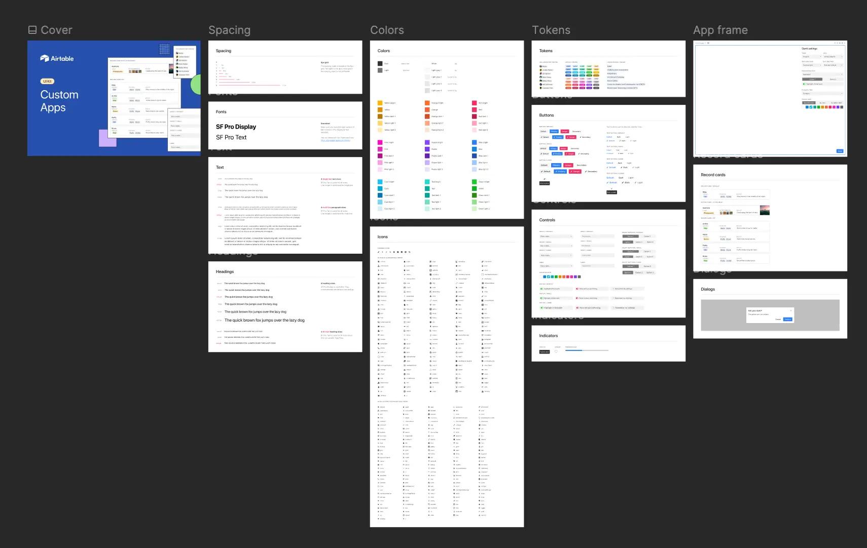
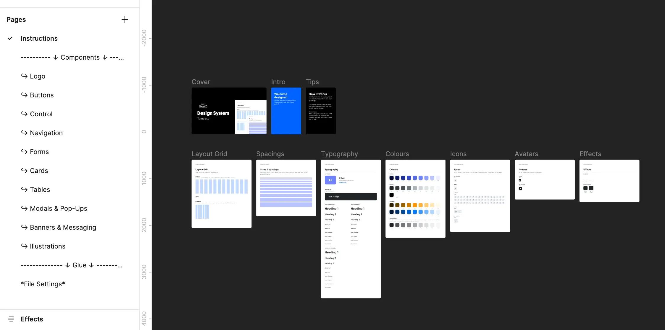
- Google's Material Design: the most widely adopted system in the world. Its component documentation, with do-and-don't examples for every element, is the standard for how to write usage guidelines.
- Atlassian Design System: a masterclass in keeping dozens of products (Jira, Confluence, Trello) recognizably one family while each does a very different job.
- IBM's Carbon: open source and built for scale, with design and code kept in lockstep. Worth studying for how tokens connect Figma styles to shipped CSS.
Notice the pattern: none of these are static PDFs. They're living libraries that teams actually build from, and that's the bar for yours, whatever its size.
FAQ
How long does it take to build a design system?
A lean system for a small company (brand guide, core UI kit, documentation) typically takes two to six weeks. Enterprise systems take quarters, but you don't need one of those to get most of the benefit.
What's the difference between a UI kit and a design system?
The UI kit is the parts bin: the components themselves. The design system is the kit plus the rules, principles, and documentation that tell people how to use the parts.
Is Figma the right tool for a design system?
For most teams, yes. Components, variants, shared libraries, and developer inspection are built in, and everyone works from one live file instead of emailing exports.
When is a design system overkill?
If you're a solo founder with one landing page, a simple style sheet (colors, fonts, spacing) is enough. Build the full system when multiple people ship design regularly or when consistency starts visibly slipping.