
Brand design is the set of visual and verbal choices that make your company recognizable: logo, color, typography, imagery, and the personality behind all of it. When those elements agree with each other, people remember you. When they drift apart, you look like a different company on every channel, and trust quietly leaks away.
This guide walks through the nine elements that make up a brand identity, then shows how companies like Uber, Netflix, and Slack handle each one in their public brand guidelines. Steal what fits.
What is branding, really?
Branding is the sum of what people expect from you before they've worked with you. It's not the logo. The logo is just the shortcut your audience uses to recall everything else: how your product felt, how your emails read, whether you delivered.
A useful test: if you removed your logo from your website, would anyone still know it's you? If the answer is no, you have a logo, not a brand.
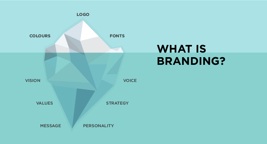
The nine elements of brand design
1. Logo
Your logo is the signature, not the story. A good one is simple enough to work at 16 pixels in a browser tab and distinctive enough to be recognized without the company name next to it. Test yours in one color, tiny, on a noisy background. If it survives all three, keep it.
2. Color scheme
Color is the fastest signal your brand sends. Pick one dominant color, one or two supporting ones, and defined neutrals, then write down exactly when each is used. The discipline matters more than the hue. We wrote more about choosing hues in the psychology of color in web design.
3. Typography
Type does most of the talking on a website, so it carries more of your personality than you'd guess. Two typefaces are usually plenty: one for headlines, one for body text, with fixed sizes and weights. More on this in typography, the voice of your design.
4. Illustration
Illustration earns its place when it explains something photos can't: abstract products, processes, future states. The trap is generic stock illustration that makes you look like every SaaS startup since 2019. If you use illustration, define a style: line weight, palette, level of detail.
5. Photography style
Decide what your photos have in common before you shoot or buy a single one. Lighting, color grading, candid versus posed, people versus product. A loose rule applied consistently beats beautiful photos that don't match.
6. Brand guidelines
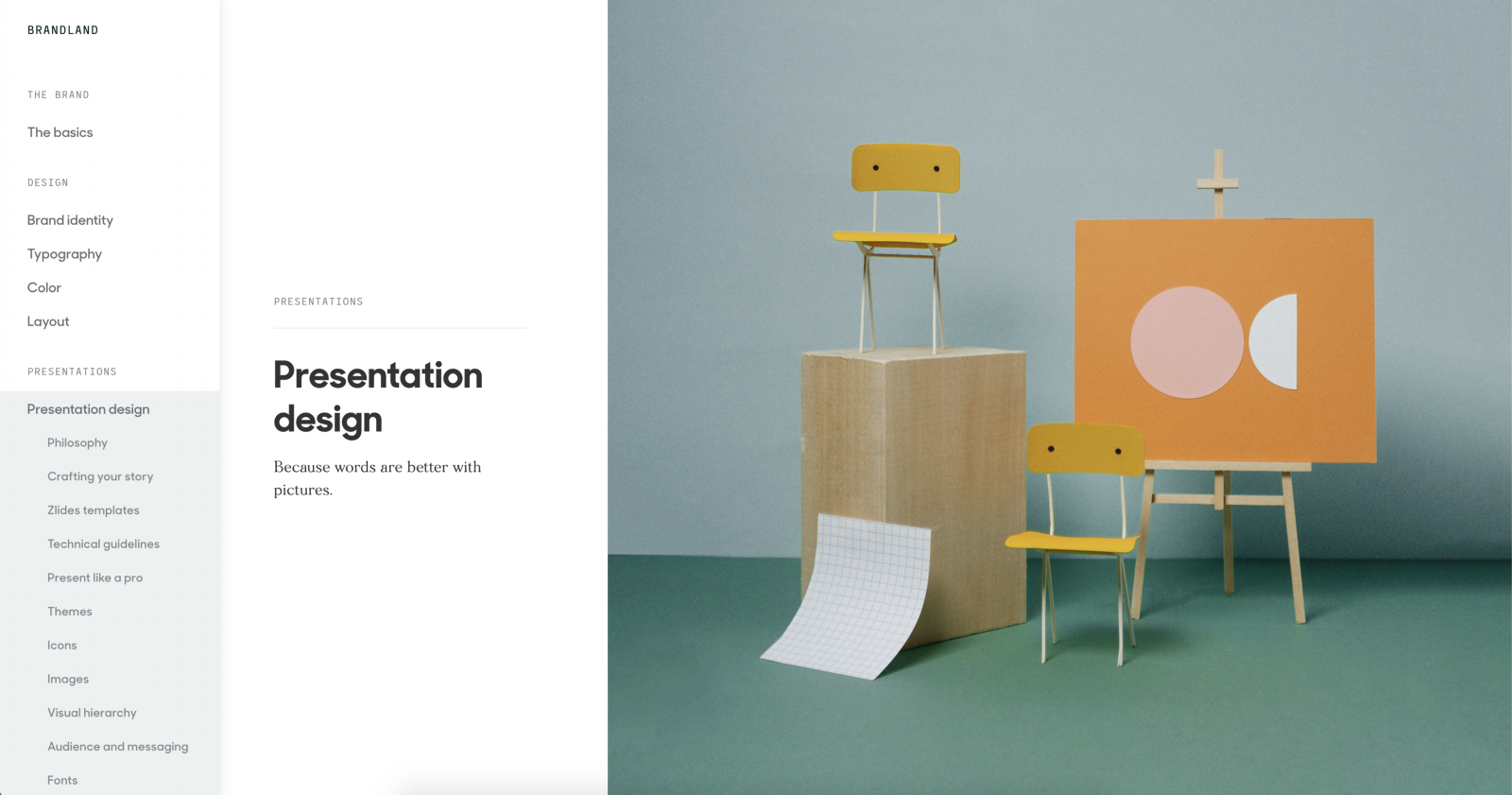
Guidelines are where the brand stops living in one designer's head. A workable document covers logo usage, color values, type scale, imagery rules, and tone of voice. It doesn't need 80 pages. It needs to be short enough that people actually open it.
7. Visual brand elements
Beyond the big five, small recurring details do heavy lifting: icon style, button shapes, patterns, the way you crop images. These are the things competitors can't copy by swapping a logo, and they're what makes brand consistency feel effortless instead of enforced.
8. Tone of voice
Your brand also sounds like something. Formal or plain-spoken, playful or precise. Write three sentences in your brand's voice and three it would never say. That one exercise prevents most off-brand copy.
9. Brand personality
Personality is the trait people would use to describe your company if it were a person. Pick two or three traits and let them drive every other element. "Friendly and precise" produces very different design decisions than "exclusive and bold."
What great brand design looks like in practice
The fastest way to learn brand design is to read the guidelines big companies publish. Here's what each of these brands does well, and what's worth borrowing.
Starbucks
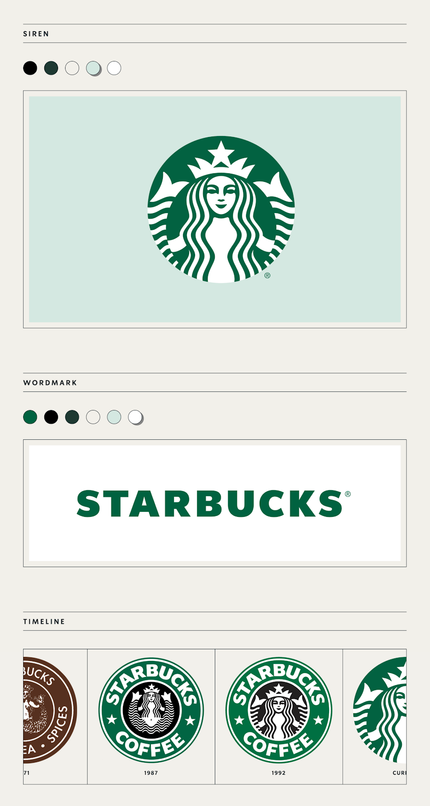
Starbucks pairs its siren logo with an earthy green palette and warm photography, and its public creative guidelines show how far one green can stretch across cups, stores, and seasonal campaigns. Borrow this: one strong color, used with total commitment.
Uber
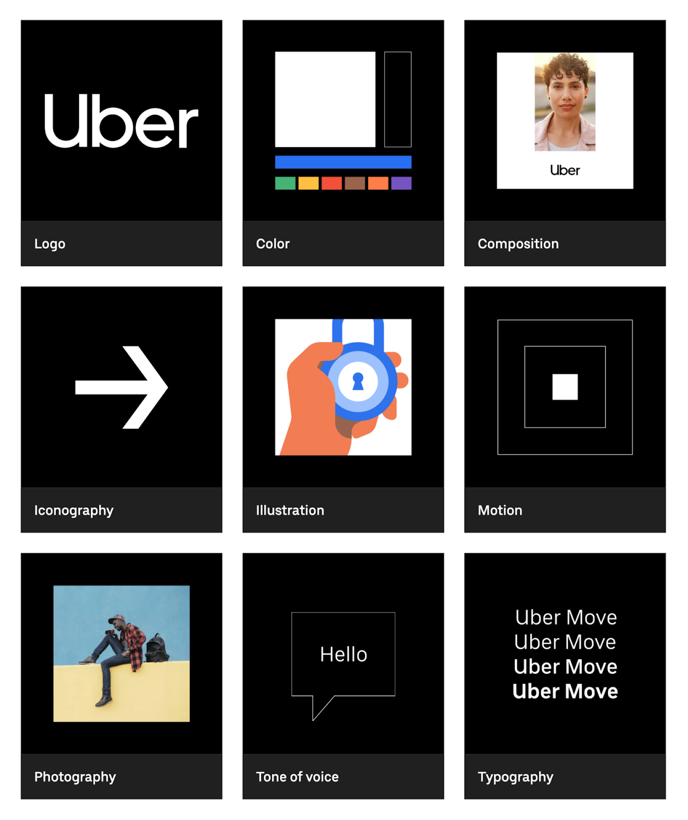
Uber's public brand system is built around a small set of core elements, with black and white doing most of the work and motion rules defined alongside static ones. Borrow this: treat motion as part of the identity, not an afterthought.
YouTube
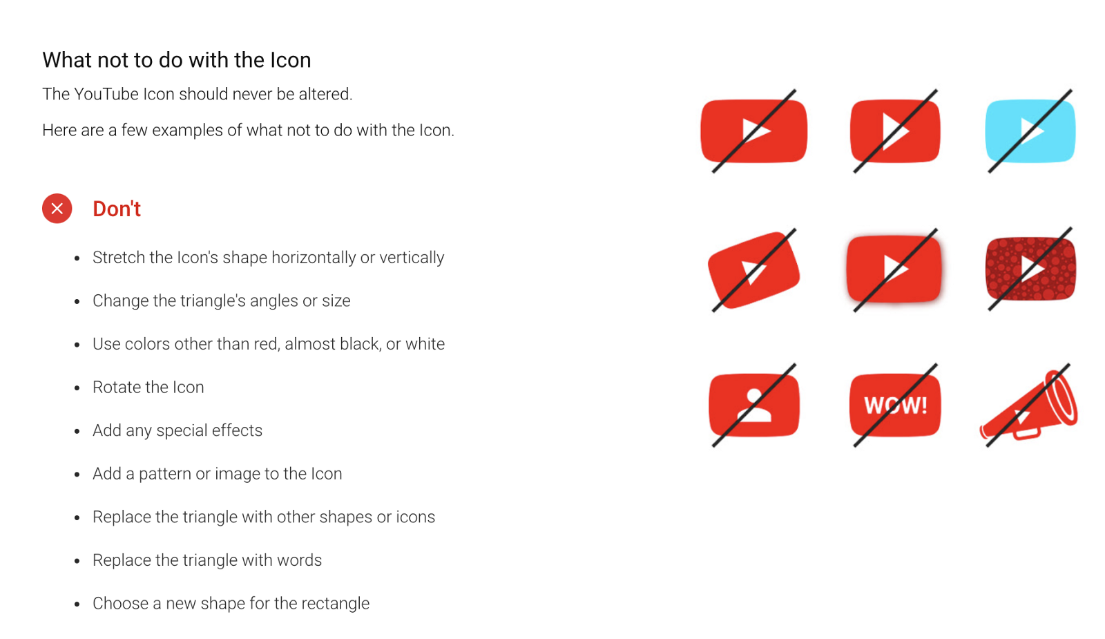
YouTube hangs everything on the red play button, a shape so simple it works as an app icon, a favicon, and a billboard. Borrow this: make your mark a shape, not a word, if you can.
Dropbox
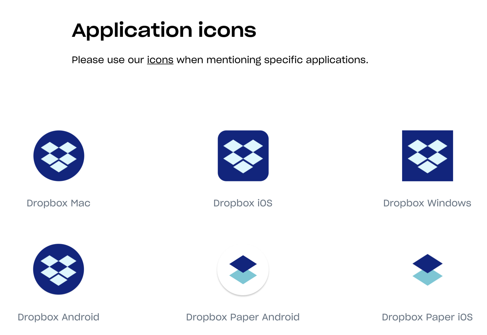
Dropbox documented its 2017 rebrand openly on dropbox.design, moving from a utility look to an expressive one while keeping the box glyph constant. Borrow this: you can change everything around a mark without changing the mark.
Netflix
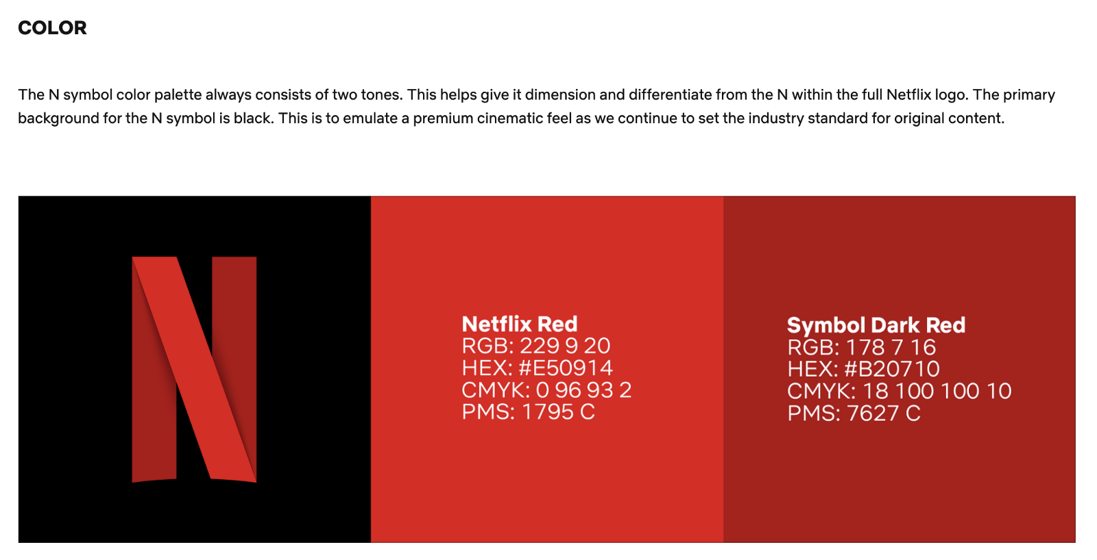
Netflix's brand site is deliberately narrow: the N, the wordmark, Netflix Red, and strict rules for each. Borrow this: a short rulebook that's actually followed beats a thick one that isn't.
Slack
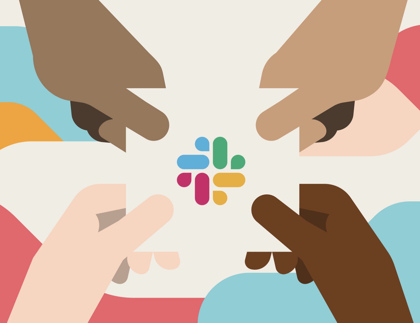
Slack's octothorpe mark is built from simple geometric pieces in four colors, and its media kit spells out exactly how the logo may and may not be used. Borrow this: publish the "don'ts" with the same care as the "dos."
Zendesk
Zendesk rebuilt its identity around a kit of simple shapes that recombine across products, so every sub-brand looks related without looking identical. Borrow this: design a system of parts, not a single fixed lockup.
Audi
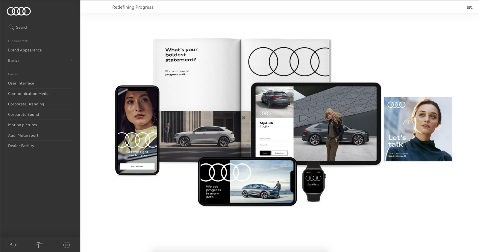
Audi runs separate guideline sets for corporate design, user interfaces, and communication media, all anchored by the four rings. Borrow this: when your brand lives in many contexts, write rules per context instead of one vague rule for all.
Spotify
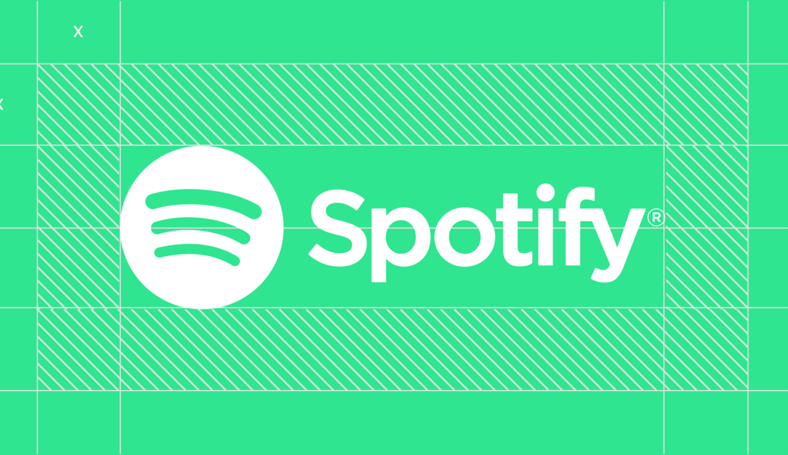
Spotify's green is unmissable, but the real system is duotone imagery and bold type that makes any artist photo look like Spotify. Borrow this: a treatment you apply to content can be a stronger identifier than a logo.
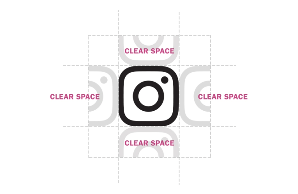
Instagram's gradient glyph is one of the few logos that made color itself the identifier. Borrow this carefully: a gradient identity only works if you use it everywhere and defend it ruthlessly.
How to apply this to your own brand
Start with personality, then work outward: traits first, then color and type that express them, then rules that keep everyone honest. Most brands fail not at the design stage but at the consistency stage, so write the guidelines while the decisions are fresh.
And revisit yearly. Every brand above has evolved. The mark stays, the system around it breathes.
FAQ
What's the difference between brand design and a logo?
A logo is one element. Brand design is the whole system: logo, color, type, imagery, voice, and the rules that hold them together.
How many colors should a brand palette have?
Usually one dominant color, one or two accents, and a set of neutrals. If your team regularly debates which blue to use, the palette is too big or too vague.
Do small companies need brand guidelines?
Yes, just shorter ones. A single page covering logo, colors, fonts, and three voice rules prevents most inconsistency, and it takes an afternoon to write.