
Typography is the voice your website speaks in. The same sentence set in a crisp grotesque, a bookish serif, or a bouncy rounded sans says three different things before the reader processes a word. Get the type right and visitors hear you clearly. Get it wrong and they hear a tone-deaf orchestra.
Back in 2006, designer Oliver Reichenstein wrote a provocation that stuck: web design is 95% typography. His point was simple and still holds. The web is overwhelmingly text, so shaping text is most of the job.
Why does typography carry so much weight?
Three reasons, stacked:
- It's the interface for your message. Your value proposition, your proof, your CTA: all words. If the words are hard to read, nothing else on the page gets a chance.
- It sets tone instantly. A law firm in Comic Sans and a kids' brand in a cold geometric sans both fail the same test: the voice doesn't match the speaker.
- It does the wayfinding. Size, weight, and spacing tell scanning readers what's a headline, what's a detail, and what's clickable. Most visitors scan rather than read, so this hierarchy IS the navigation of your content.
How do you choose fonts that fit your brand?
Think casting, not shopping. You're hiring a voice actor for everything your company will ever say on screen.
- Start with personality words. Pick the three adjectives your brand must project, then test candidate fonts against them. "Trustworthy, modern, precise" eliminates whole categories in minutes.
- Two families, clear roles. One for headlines, one for body text is plenty. Add a third only for a genuine job, like code snippets. Every extra family costs load time and coherence.
- Legibility outranks character. A distinctive display font can headline, but body text needs boring virtues: open letterforms, clear distinction between I, l and 1, comfortable at 16px.
- Check the full character set. Numbers, currency symbols, diacritics if you serve international markets. Fonts fail in the details you didn't preview.
What are the mechanics of readable text?
Font choice gets the attention, but settings do the daily work. The defaults worth stealing:
- Body size: 16px minimum, and don't be afraid of 18px for content-heavy pages.
- Line height: around 1.5 for body text. Cramped lines are the most common readability bug we find in audits.
- Line length: roughly 45 to 75 characters per line, the typographer's rule of thumb. Full-width paragraphs on a desktop screen force the eye to commute.
- Contrast: meet the WCAG ratio of at least 4.5:1 for body text. Fashionable light gray on white quietly excludes a chunk of your audience; more in our accessibility guide.
- Real hierarchy: each heading level visibly distinct, and used in order. If your H2 and H3 look the same, you have decoration, not structure.
Pair those settings with generous whitespace and even mediocre fonts read well. Skip them and no font can save you.
Who gets typography right?
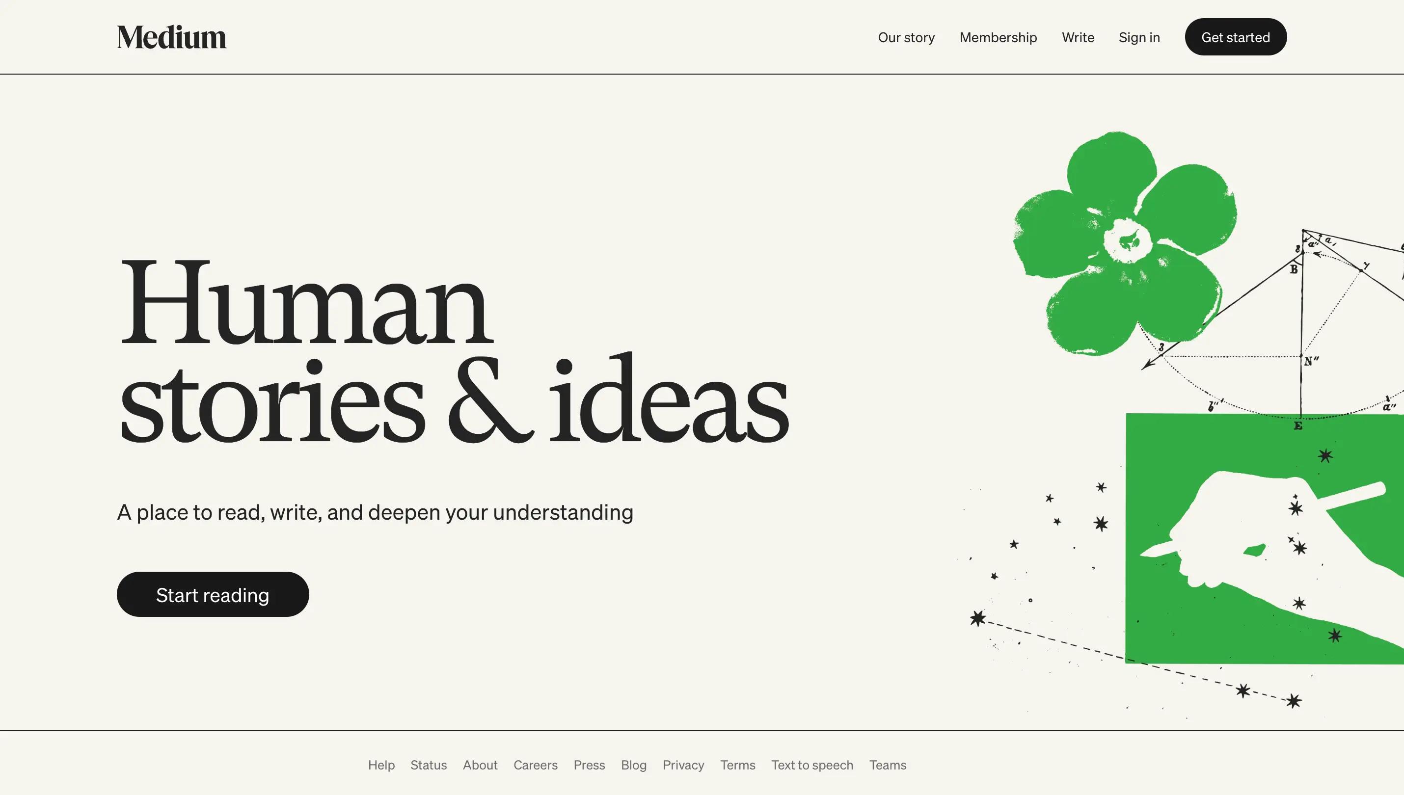
Medium built an entire product thesis on reading comfort: big type, tall line height, nothing competing with the text.
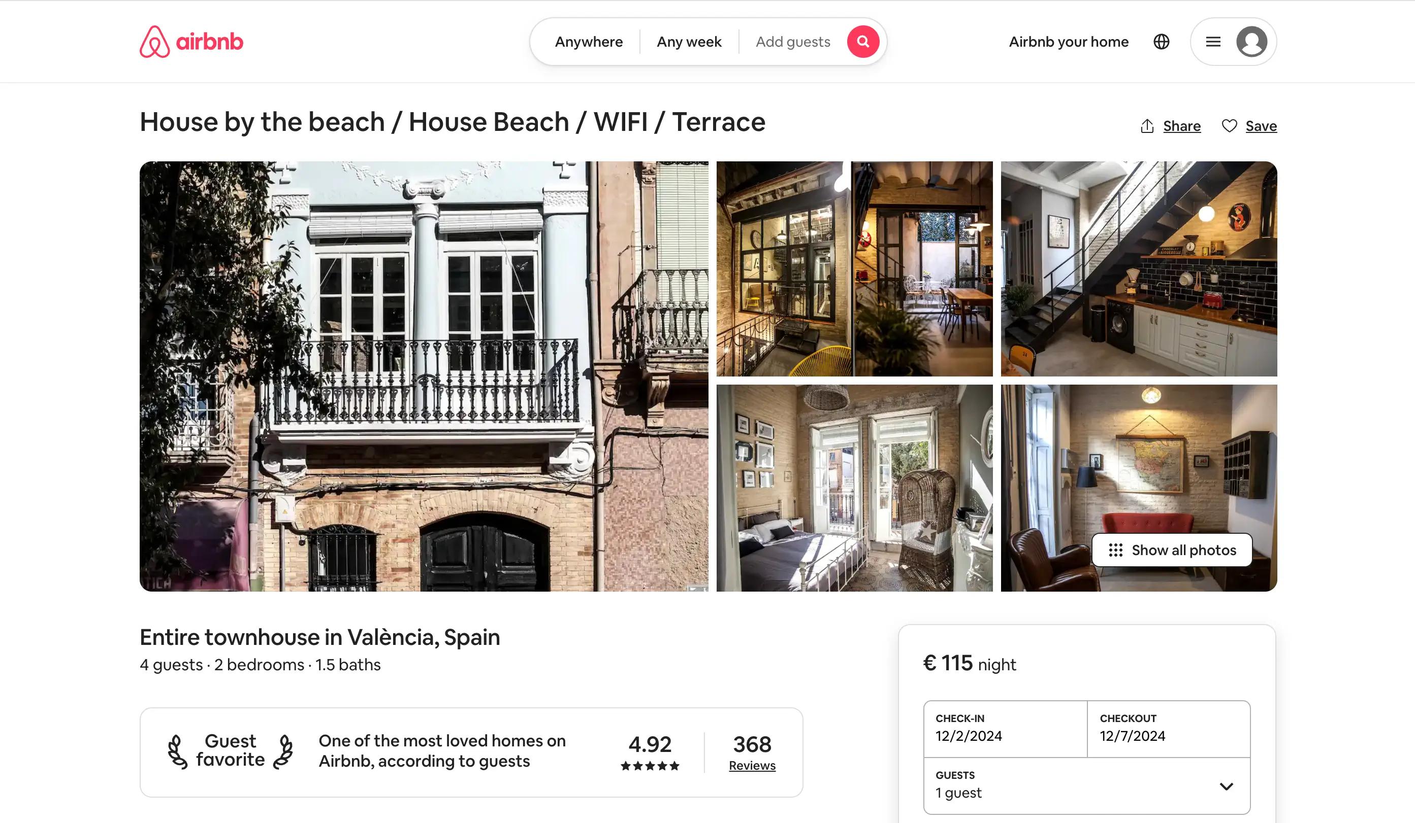
Airbnb designed its own typeface, Cereal, tuned to feel friendly and work at every size from buttons to billboards.
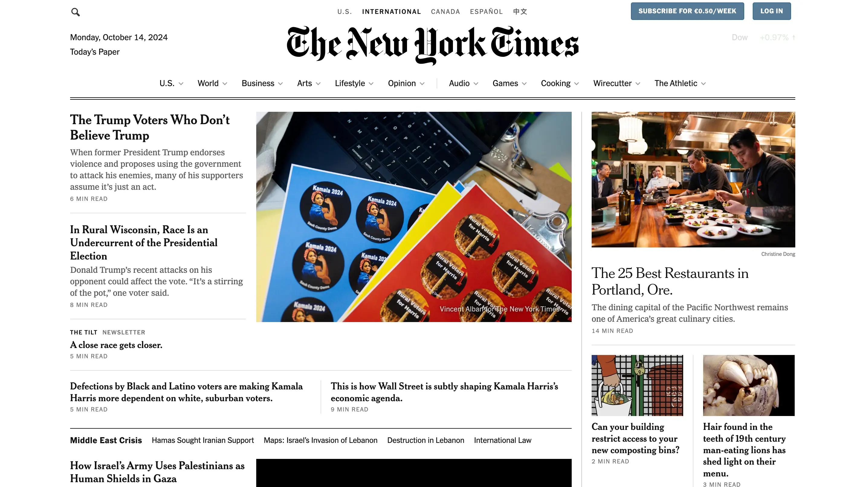
The New York Times uses its serif tradition as a trust signal: the type itself says "we've been doing this a while".
Three different voices. Zero ambiguity about who's speaking.
The 10-minute typography audit
Open your site and check: How many font families load? Is body text at least 16px with roomy line height? Do your paragraph lines run under about 75 characters? Does the text pass a contrast checker? Can you tell H2 from H3 at a squint?
Fixing just the failures in that list is an afternoon of CSS, and it upgrades every page at once. That's the quiet power of typography: one decision, sitewide returns.
FAQ
Serif or sans-serif for a website?
Both work on modern screens. Choose by brand voice: serifs lean editorial and established, sans-serifs lean modern and neutral. Readability depends more on size, spacing, and contrast than on the category.
Are system fonts or custom fonts better?
Custom fonts buy distinctiveness at the cost of load time; system fonts are instant but anonymous. A good compromise: one custom family for headlines, a fast stack for body text.
How many font weights should I load?
Usually three or four: regular and bold for body, plus one or two for headlines. Every weight is a file your visitors download.