
A high converting landing page does ten jobs in a fixed order: five above the fold to earn attention, five below it to earn the sale. Visitors decide in seconds whether you can solve their problem, so clarity beats cleverness every time.
Donald Miller calls this the grunt test in Building a StoryBrand: a caveman should be able to glance at your page and grunt back what you offer. Here's the full framework.
Above the fold: pass the grunt test
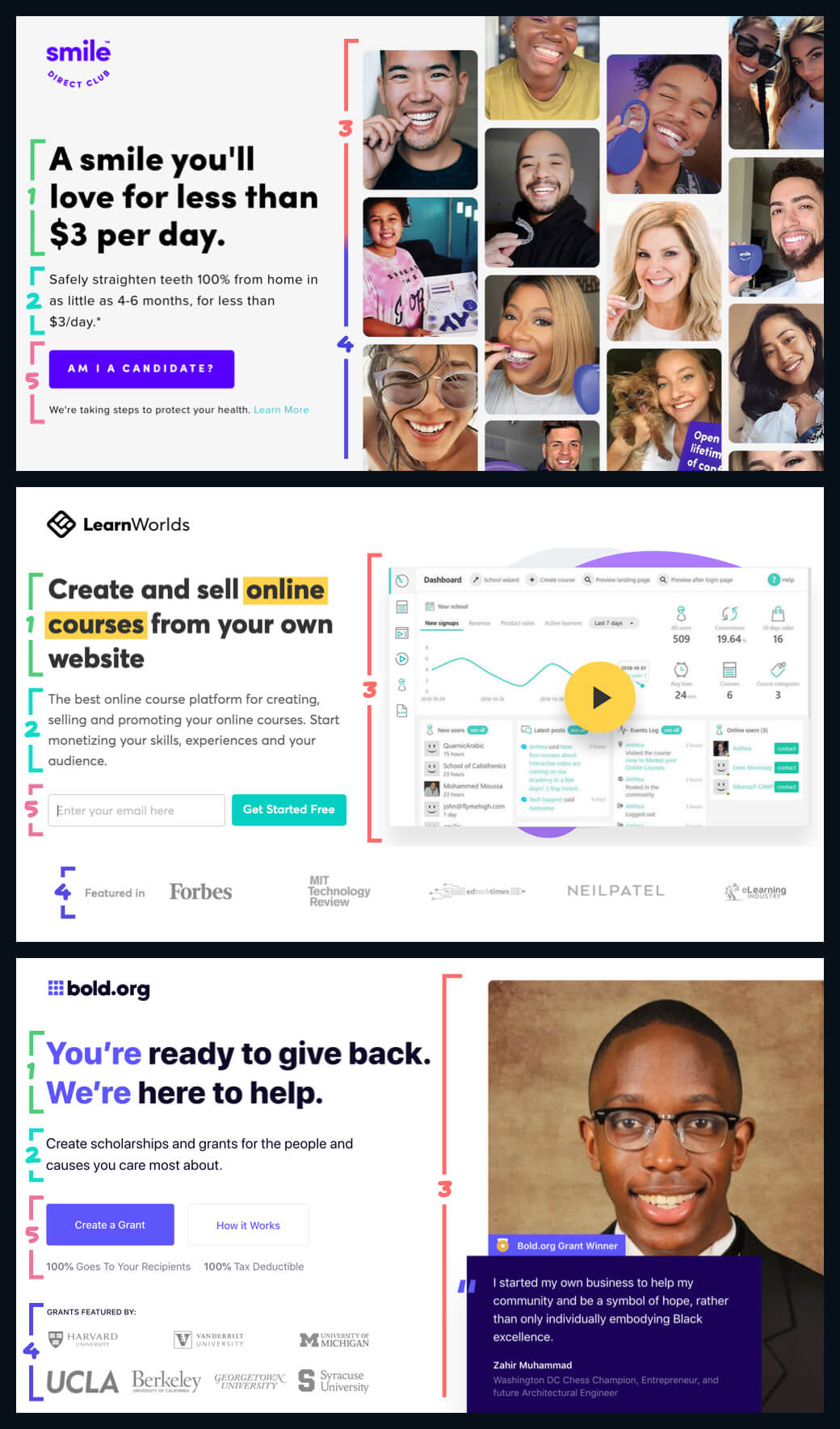
The first screen has five jobs:
- Explain the value you provide (title)
- Explain how you'll create it (subtitle)
- Let the user visualize it (visual)
- Make it believable (social proof)
- Make the next step easy (CTA)
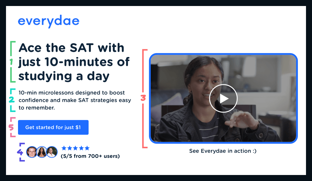
1. Title: say the value out loud
There are a hundred ways to write a great title. Three cover most cases.
Explain what you do. If your product is genuinely unique, the simplest possible description is the strongest title. Don't dress it up.
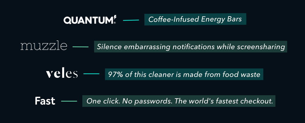
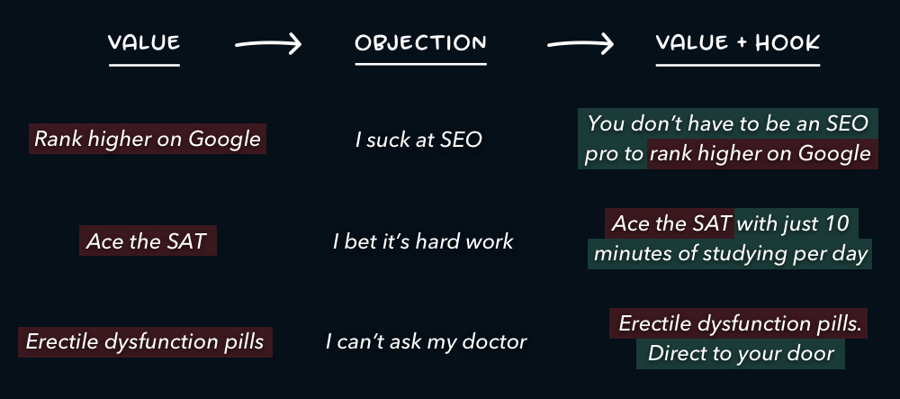
Use a hook. Most products aren't unique, so a hook adds the edge. The easiest hook to write: take your customer's biggest objection and answer it in the headline.
Own your niche. Some brands skip the hook and plant a flag instead. One line, written with total conviction, that says: for this problem, we are the solution.
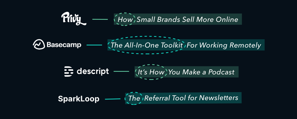
2. Subtitle: get specific
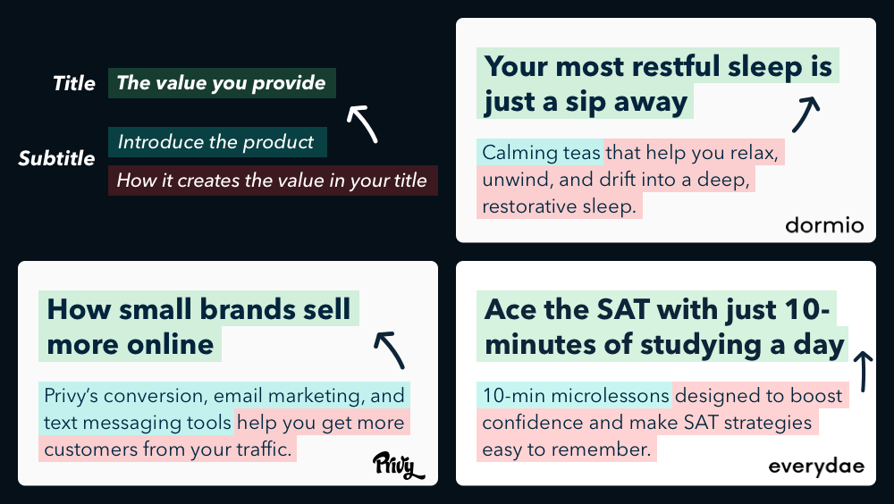
The title promises value. The subtitle explains the mechanism: what the product is and how it delivers that promise. If your title is the "what", the subtitle is the "how".
3. Visual: show the product, not a metaphor
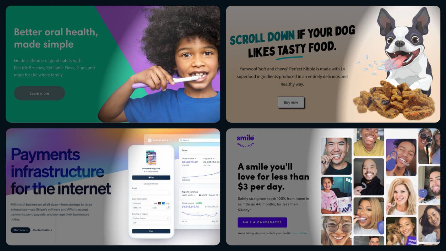
Show the actual product, as close to reality as you can. A real screenshot beats an illustration. The product in action beats a screenshot.
Abstract blobs and stock photos of handshakes tell the visitor one thing: you're hiding something.
4. Social proof: make the promise believable
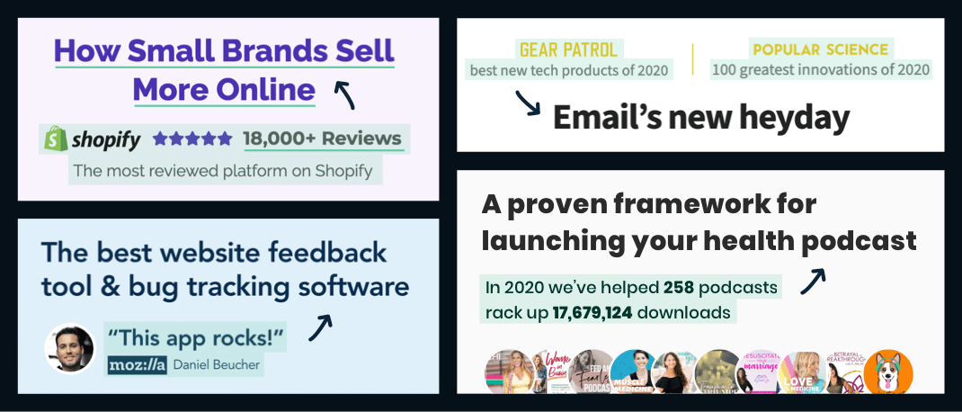
Above the fold, social proof works as instant credibility. Any startup can claim "how small brands sell more online." When Privy ran that headline, it was the review count next to it, 18,000+ at the time, that made you believe it.
A number, a logo row, or a rating does the job. Pick the strongest proof you honestly have.
5. CTA: lower the cost of clicking
Most buttons emphasize action: Sign Up, Start Trial. Three patterns usually work harder:
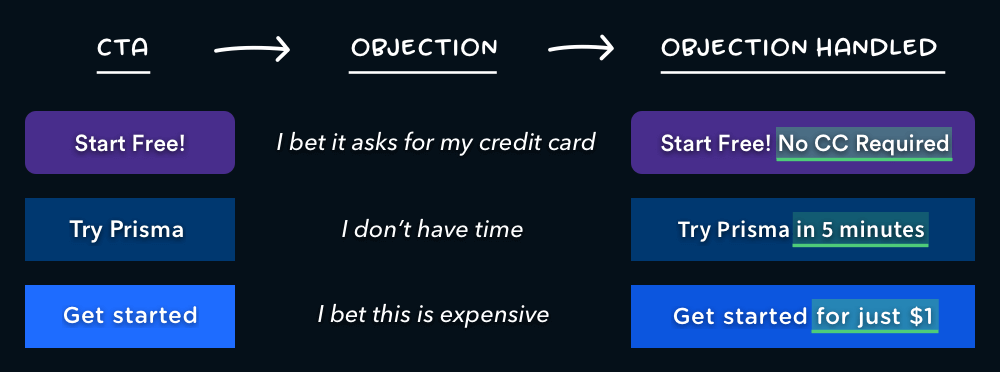
Call to value. Make the button promise the outcome, not the task. The trick is to echo the value your title already promised.

Objection handle. A few words next to the button that kill the biggest reason not to click: "No credit card required" has probably earned more signups than any headline.
Email capture plus CTA. Pair an email field with the button so starting takes one step. You can collect the rest during onboarding. For where buttons belong on the page, see our post on CTA placement.
Above the fold recap
In the first few seconds, visitors decide whether you can help them. Make that decision easy: value, mechanism, picture, proof, next step. Clarity over creativity. This is the same instinct behind the 3 second rule of web design.
Below the fold: earn the sale
Above the fold you earned attention. Below it, five more jobs close the deal:
- Make the value concrete (features and objections)
- Inspire action (more social proof)
- Tie up loose ends (FAQ)
- Repeat the ask (second CTA)
- Make yourself memorable (founder's note)
6. Features and objections: cash the check
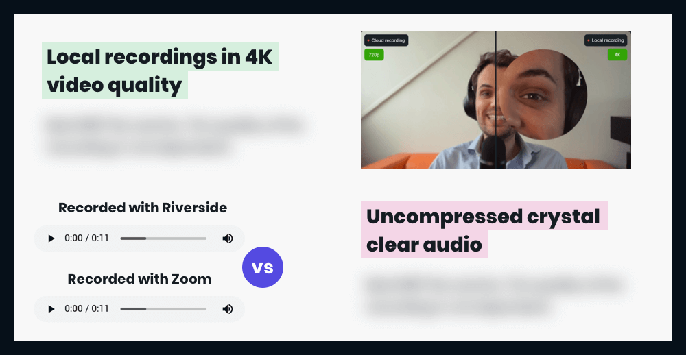
Your headline wrote a check. The features section cashes it. Riverside's title promises "podcasts that look and sound amazing", and its first two features show exactly how: studio quality video and audio, explained concretely.
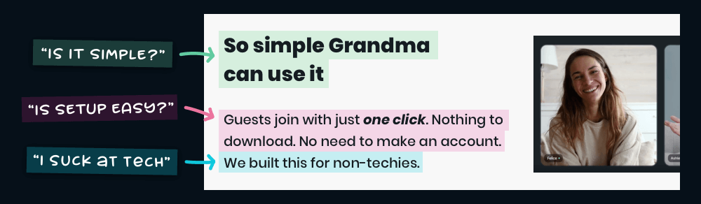
Then handle objections. This means actually talking to customers: collect the doubts that keep coming up, group them, and answer each one in the customer's own words.
7. More social proof: show the happy ending
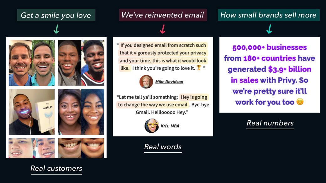
Below the fold, social proof changes jobs. It stops proving you're credible and starts showing what life looks like after buying. Use existing customers to bring the promised value to life:
- "Get a smile you love" becomes photos of customers smiling
- "Email reinvented" becomes customers describing the before and after
- "How small brands sell more" becomes real sales numbers
We dug into what makes quotes persuasive in our post on customer testimonials.
8. FAQ: tie up loose ends
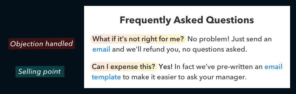
Some objections and details don't fit neatly anywhere above. That's the FAQ's job. Write down everything a hesitant buyer still wonders, reframe each as a question, and answer it in two or three sentences.
9. Second CTA: ask again, with room to breathe
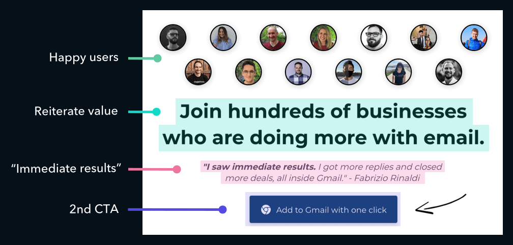
By now you've made the case, so don't drop one lonely button at the bottom. Use the space: restate the value, add the proof point, then ask. The reader who scrolled this far wants a reason to say yes.
10. Founder's note: make yourself memorable
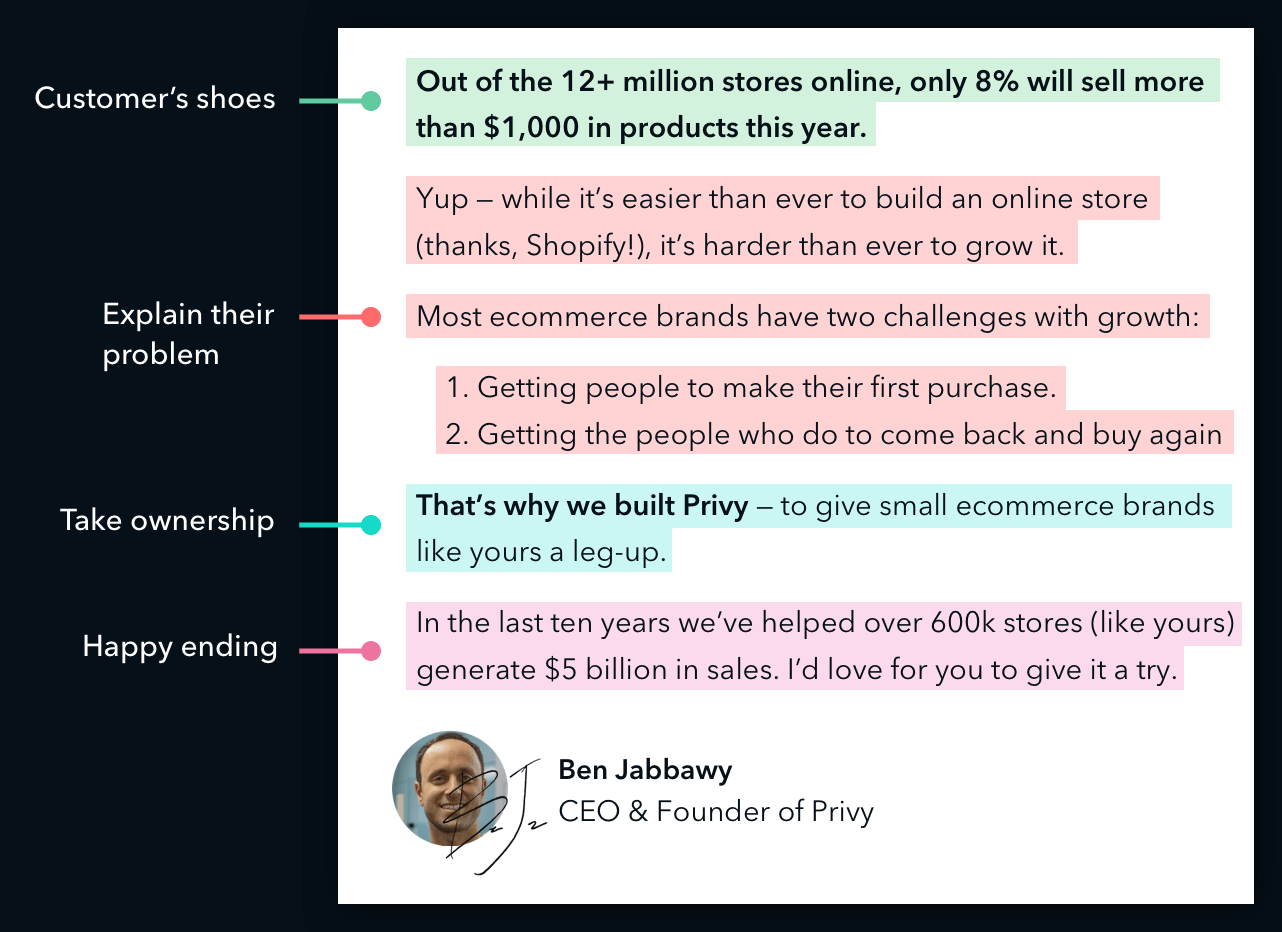
End with a short story that makes your company easy to sum up:
- Put yourself in the customer's shoes
- Describe their problem like you've lived it
- Take ownership of solving it
- Show the happy ending
You're walking them down a path they want to walk themselves. And people buy from people.
The full framework
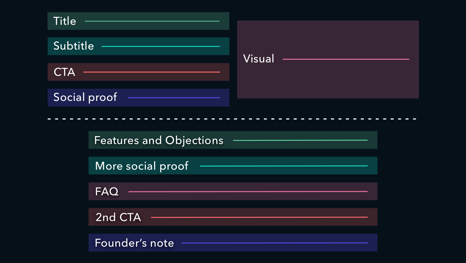
- Explain the value you provide (title)
- Explain how you'll create it (subtitle)
- Let the user visualize it (visual)
- Make it believable (social proof)
- Make taking the next step easy (CTA)
- Make the value concrete (features and objections)
- Bring the offer to life (social proof)
- Tie up loose ends (FAQ)
- Repeat your call to action (second CTA)
- Make yourself memorable (founder's note)
One last thing
Your landing page is your sales pitch in written form. Examine every element and ask: would this help me sell if I met the customer in person?
If not, cut it. And if you don't know, go sell to a few customers face to face. You'll learn fast that fancy words and handshake stock photos get you nowhere, and you'll come back with the exact words your page was missing.