
A website audit is a structured review of how your site performs: user experience, conversion paths, speed, mobile behavior, and content. You run one to find where visitors drop off and fix the leaks in order of impact. This guide walks you through the whole process, plus the anatomy of a landing page that actually converts.
Why bother? Because most sites don't lose customers at the big dramatic moments. They lose them to a slow page here, a confusing menu there, a buried CTA on the one page that matters.
What is a website audit, really?
It's not a checklist you tick once and frame. It's a deep look at what your site does to real visitors, across five areas:
- User experience: can people find what they came for without thinking?
- Conversion: where does the path from landing to enquiry break?
- Performance: how fast do pages load, especially on a phone on mediocre wifi?
- Mobile: does the site work with thumbs, not just cursors?
- Content and SEO: does each page say something clear, to the right search intent?
The point isn't a list of problems. It's a ranked list of opportunities: fix this first, that second, ignore the rest.
What makes a landing page convert?
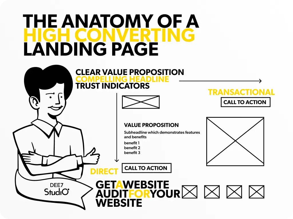
Your landing page is the handshake. Research by Gitte Lindgaard and colleagues, published in Behaviour & Information Technology, found people form a visual judgment of a web page in as little as 50 milliseconds, and that snap judgment colors everything they think afterward. So the page has to look right before it can argue right.
The elements that do the heavy lifting:
- A clear value proposition. One sentence that says what you do, for whom, and why it's better. If a stranger can't repeat it back after five seconds, rewrite it.
- A headline that favors clarity over cleverness. "Websites that turn B2B traffic into pipeline" beats a pun every time.
- Trust indicators. Client logos, testimonials, review scores. Skepticism is the default; proof is the antidote.
The hero section
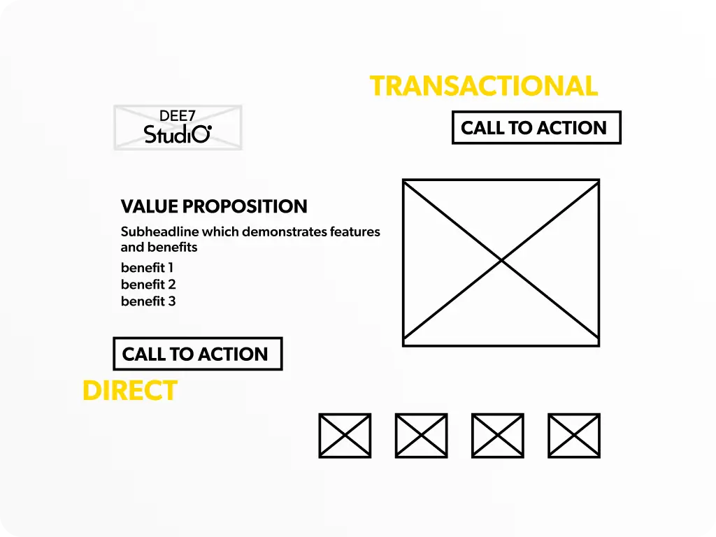
This is the most expensive real estate you own. It needs three things: the core message, a relevant visual, and one obvious call to action. Everything else in the hero is a distraction wearing a nice outfit.
The call to action
Make it visually distinct, use action language ("Get the audit" beats "Submit"), and put one within the first screen. Then repeat it after each section that builds the case. We broke the whole page down into a checklist in our 10-point landing page framework.
Whitespace and hierarchy
Clutter is the enemy. Whitespace isn't wasted space; it's what makes the important things look important. Big and bold for the message, small and quiet for the supporting cast.
Mobile responsiveness
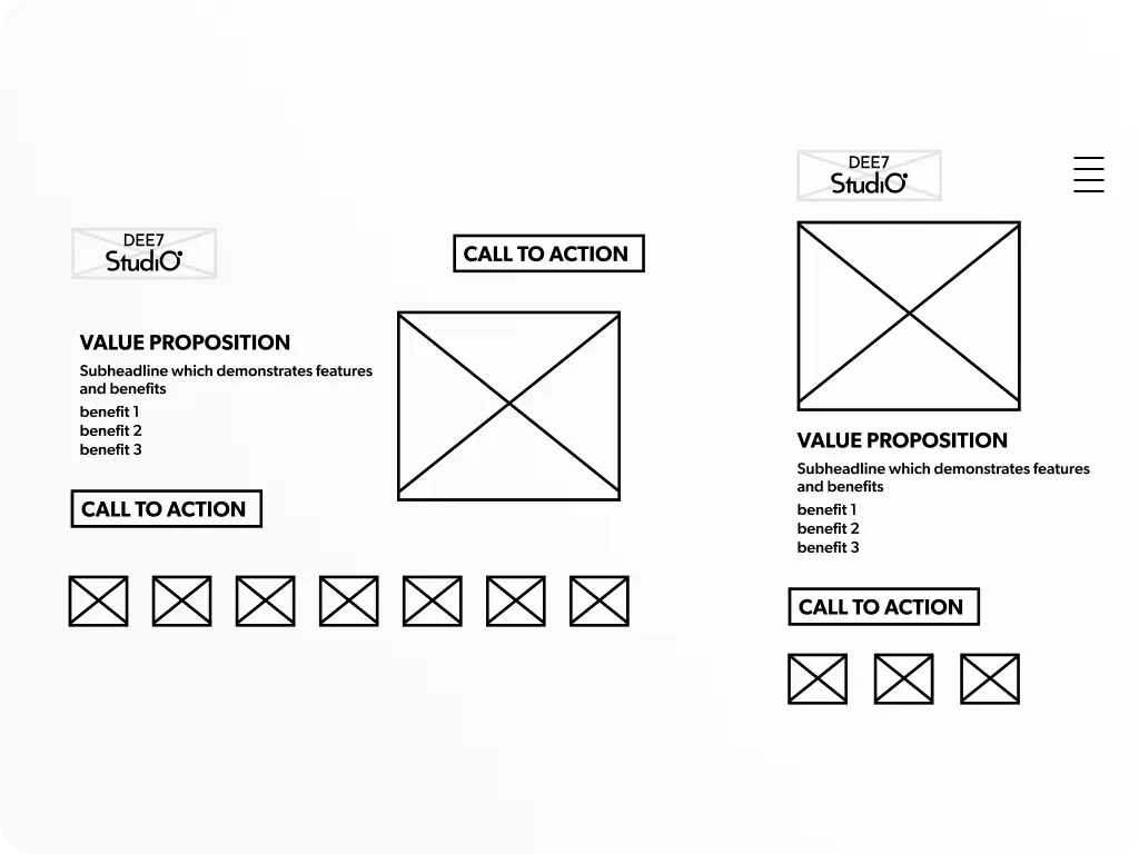
Mobile devices account for more than half of web traffic worldwide, so a landing page that only works on desktop is turning away the majority of visitors. Google's mobile speed research found that 53% of mobile visits are abandoned when a page takes longer than three seconds to load. Fluid layout, thumb-sized buttons, fast loads. We go deeper in mobile-first design.
Why "don't make me think" beats flashy design
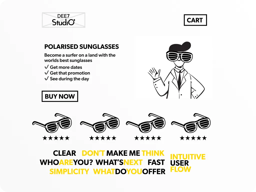
Usability author Steve Krug's rule still holds: when a site makes people work to figure it out, they trust it less. Confusion reads as carelessness.
- Navigation: clear labels, few top-level items, a search box on larger sites. Users shouldn't need a map.
- User flow: each page should lead naturally to the next step. The path to conversion should feel like a corridor, not a maze.
- Accessibility: sufficient contrast, alt text, keyboard navigation. An accessible site works for everyone, and that's just good business.
- Speed: compress images, cache aggressively, cut scripts you don't need. Slow pages bleed conversions quietly.
Which UX laws should guide your pages?
Three psychological principles do most of the practical work:
- Hick's Law: fewer choices, faster decisions. More options means longer deliberation. On a landing page, that argues for one CTA, not four.
- Miller's Law: chunk your information. George Miller's classic psychology research put working memory at around seven items, give or take two. Break content into short sections, lists, and groups.
- The aesthetic-usability effect: pretty feels usable. People perceive attractive designs as easier to use, even when they aren't. Use that halo, but don't hide behind it.
Every one of these is really about the same thing: reducing mental effort. We covered the cost of ignoring that in cognitive load, the silent conversion killer.
How does storytelling fit in?
Donald Miller's StoryBrand framework gives your page a plot: the customer is the hero, you are the guide. Three moves:
- Name the hero's problem. Speak to the visitor's actual frustration, in their words.
- Position yourself as the guide. Show empathy for the problem and authority to solve it (that's what your proof section is for).
- Give them a plan and a call to action. Three simple steps and one button. Heroes act.
How do you run a website audit, step by step?
When: quarterly for most businesses, immediately after any performance drop, and before and after major site changes.
Who: not just the tech team. You want UX eyes, a content person, someone who knows SEO, and whoever talks to customers daily. They hear the complaints your analytics can't.
Tools worth having open:
- Google Analytics for traffic and behavior
- Hotjar or Microsoft Clarity for heatmaps and session recordings
- Google PageSpeed Insights for performance
- Screaming Frog for technical SEO crawls
Metrics to pull: conversion rate, bounce rate, page load time, mobile versus desktop performance, top exit pages, and user flow between pages. Then the only question that matters: where is the biggest gap between traffic and action? Start there. Data without action is just noise with a dashboard.
What are the most common pitfalls an audit finds?
- Slow load times. Usual suspects: oversized images, too many scripts, no caching or CDN.
- Confusing navigation. Vague labels, too many menu items, no breadcrumbs on deep sites.
- Weak or missing CTAs. Pages that inform but never ask. Every page needs a next step.
- A poor mobile experience. Tiny tap targets, text that needs zooming, layouts that break.
- Checkout and form friction. For e-commerce this is the big one: Baymard Institute's long-running meta-analysis puts the average cart abandonment rate around 70%. Long forms and surprise costs do most of that damage.
Five fixes you can make this week
- Run a speed test. PageSpeed Insights will hand you a prioritized fix list for free.
- Simplify your homepage. Remove anything that doesn't serve the primary goal.
- Check your site on a real phone. Not the responsive preview. Your actual phone, on mobile data.
- Add social proof above the fold. One strong testimonial or a row of client logos.
- Review every page's CTA. Clear, visible, action-oriented, singular.
Optimization never ends (and that's good news)
A website is never "done." Markets shift, expectations rise, and last year's great page is this year's average one. The upside: improvements compound. A small conversion lift, held for a year, is real money.
So don't aim for perfection. Aim for one measured improvement at a time. Audit, fix, measure, repeat.
FAQ
How often should I audit my website?
Quarterly is a sensible default. Audit immediately if conversions or traffic drop suddenly, and always before and after a redesign.
How long does a website audit take?
A focused audit of a typical B2B site takes a few days to a couple of weeks, depending on size and how much user data you have to dig through. The fixes take longer than the finding.
Can I audit my website myself?
Yes, for the basics: speed tests, mobile checks, and CTA reviews need no specialist. An outside audit earns its fee on the things you've gone blind to, which is usually the messaging.