
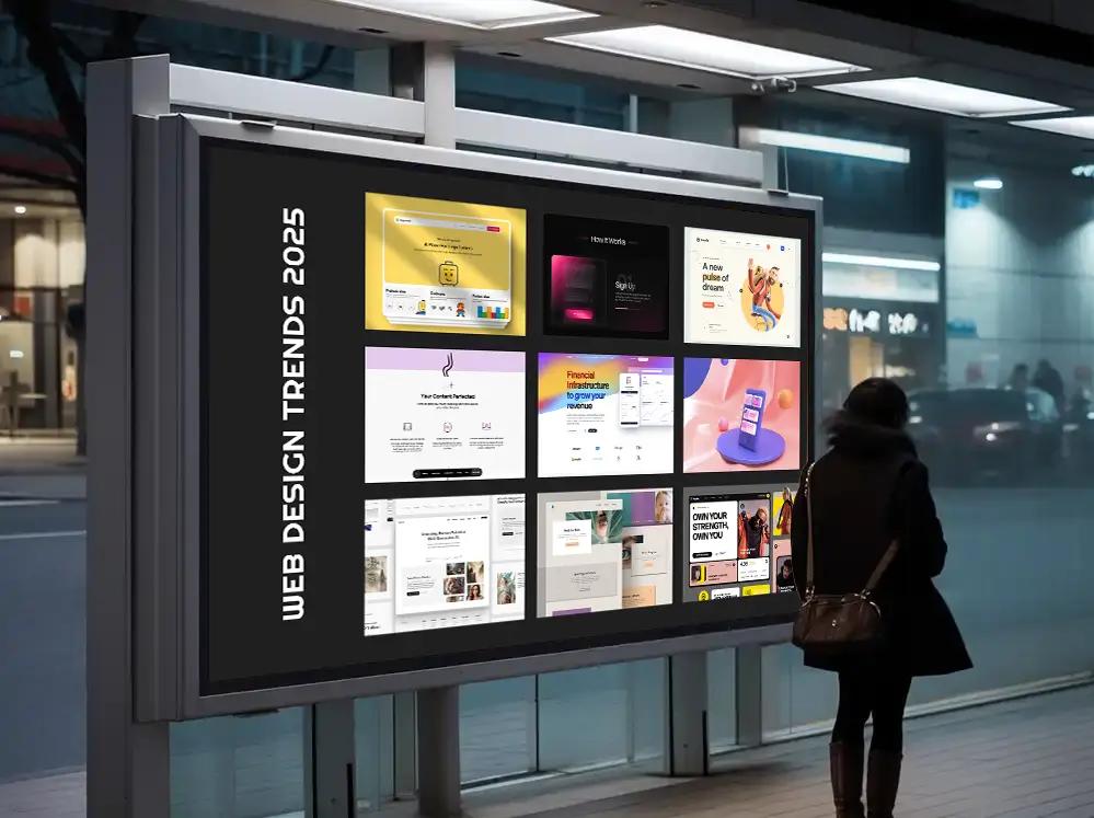
The web design trends that defined 2024 were Bento grid layouts, dark mode, purposeful 3D, micro-interactions, subtle gradients, claymorphism, functional minimalism, asymmetrical layouts, modern brutalism, and custom illustration. Most of them were reactions to the same problem: websites had started looking identical. This guide covers all ten, who each one is for, and how to apply them without hurting conversions.
A note before we start. This is a trends piece from late 2024, and we've kept it that way on purpose. Trends age, but the reasoning behind them doesn't, and most of these have quietly become defaults rather than disappearing. Read each entry as a tool with a use case, not a rule. The wrong trend on the wrong site will cost you conversions faster than no trend at all.
1. Bento grid layout: order for busy pages
Named after the Japanese lunch box, the Bento grid organizes content into distinct cards of varying sizes inside one tidy grid. Apple's keynote slides and product pages pushed this look into the mainstream, and half the SaaS industry followed.
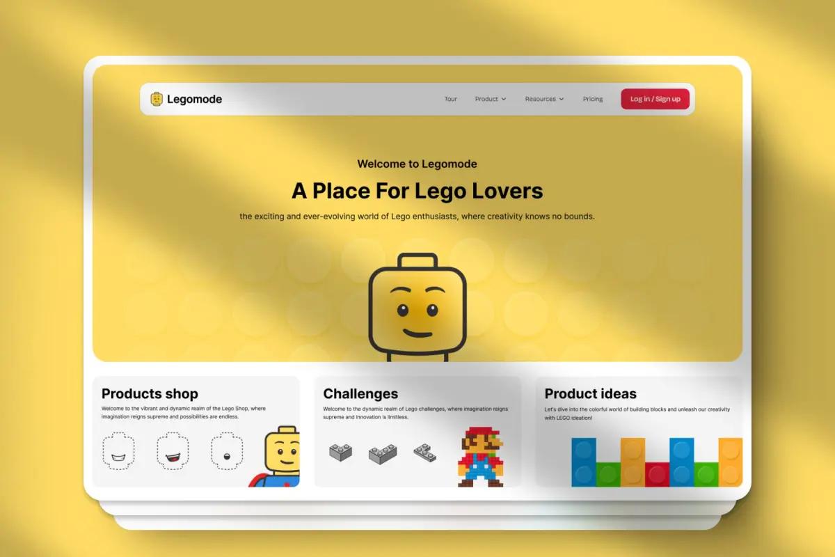
Why it took off: it solves information overload. Each card holds one idea, the size of the card signals its importance, and the whole page becomes scannable at a glance.
Best for: portfolios, product feature overviews, content-heavy blogs, and SaaS dashboards.
Watch out for: responsive behavior. A Bento grid that sings on desktop can collapse into a long, meaningless stack on mobile. Design the mobile order first. And if you only have three things to say, you don't need nine boxes.
2. Dark mode: beyond the aesthetic
Dark mode went from developer preference to mainstream expectation, and it earns its place when it's offered as a choice.
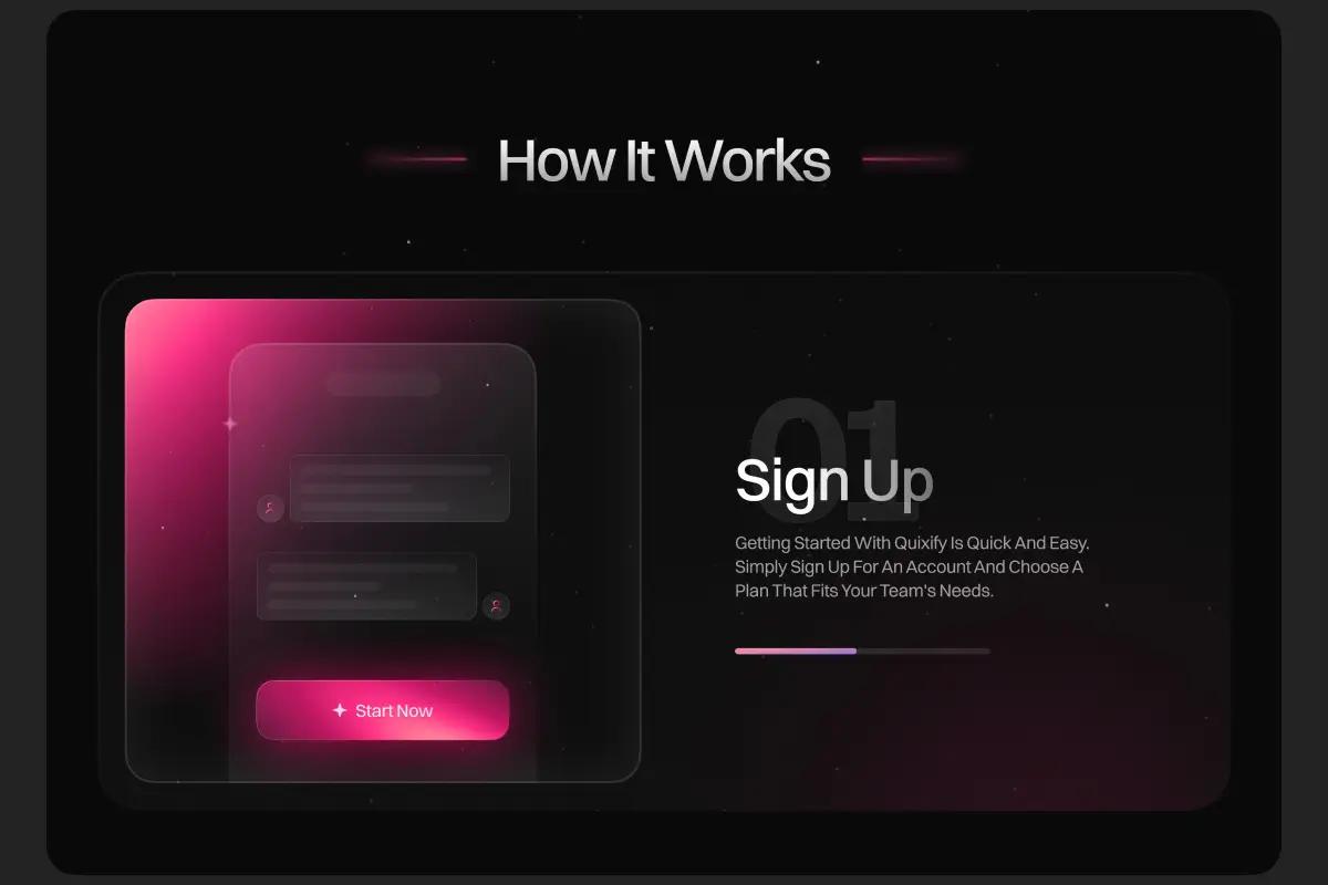
What's actually true about it: many users find dark interfaces more comfortable in low light, and it can save battery on OLED screens. Be careful with that second claim though: a Purdue University study found the savings are large at full brightness but only around 3 to 9 percent at typical brightness levels.
Implementation rules:
- Respect the system preference by default, and let users override it.
- Don't just invert colors. Check contrast ratios; pure white text on pure black is harsh.
- Test every content type: images with white backgrounds, charts, and embedded media all break in dark mode first.
3. 3D design: from gimmick to tool
2024 was the year 3D on the web stopped being a party trick. Better browser performance and tools like Spline and Three.js made interactive 3D practical for ordinary teams.
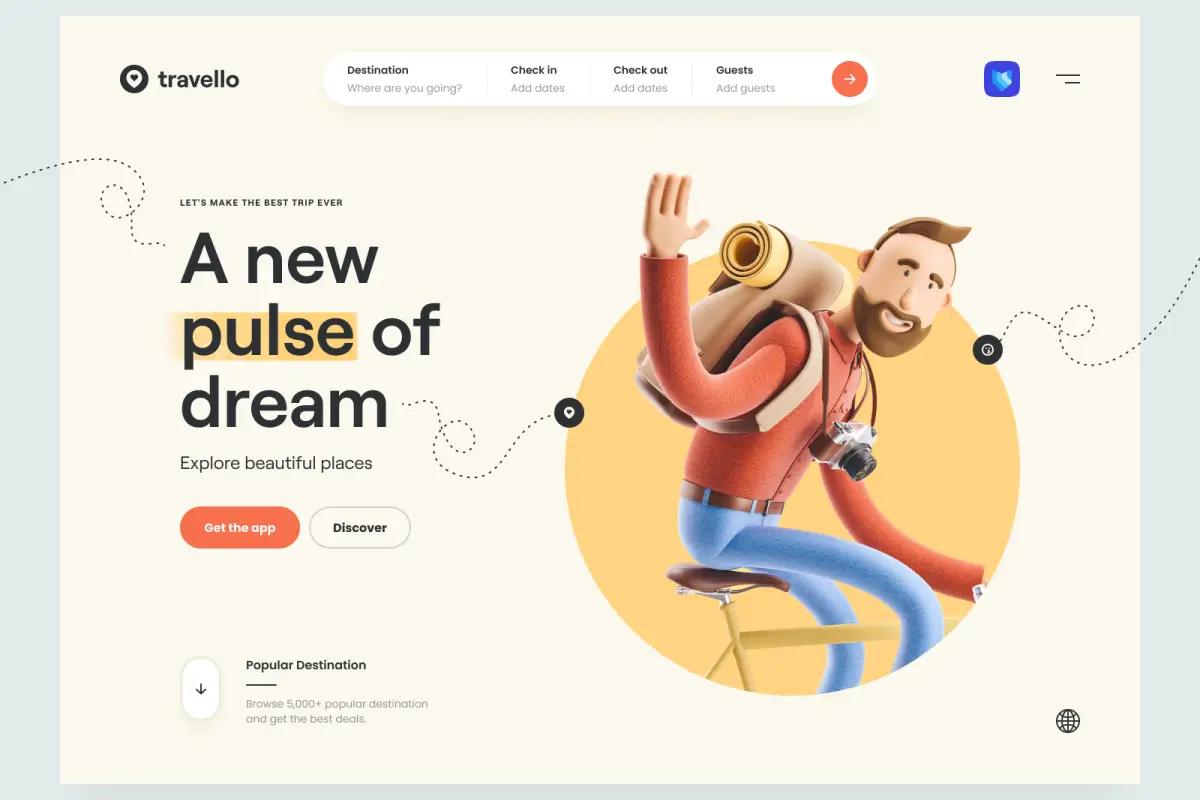
Where it earns its cost: product demonstrations you can rotate, interactive storytelling, and brand moments where differentiation is the whole point.
Where it doesn't: decoration. Every 3D scene costs load time, and slow pages lose visitors before the fancy part even renders. If a static image communicates the same thing, use the image.
4. Micro-interactions: the devil's in the details
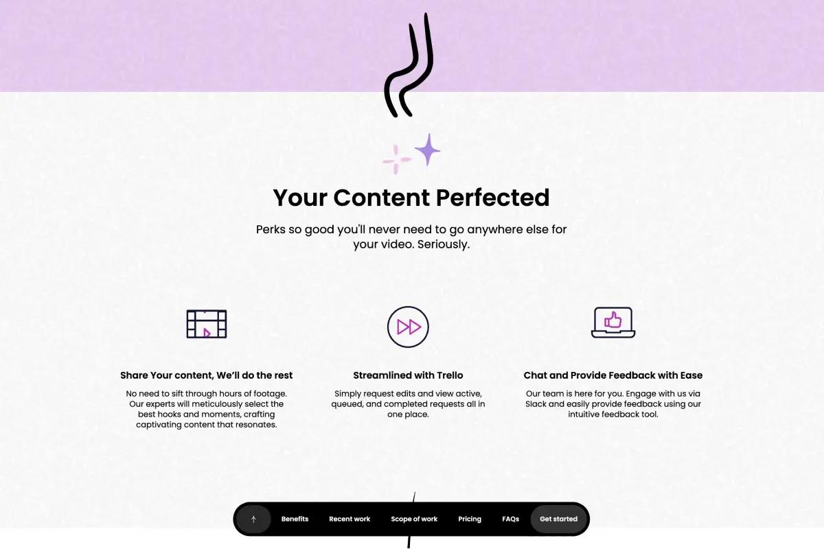
Hover states, form feedback, loading animations, success messages. Small moments, but they're how a site tells you it's listening. They're the digital equivalent of a firm handshake.
The rules that keep them useful:
- Subtle beats showy. A 150 millisecond ease is feedback; a 1 second bounce is a delay.
- Be consistent. If one button animates, they all should.
- Never let animation block the user or tank performance.
This trend aged the best of the ten, because it was never really a trend. We went deeper on it in our post on micro-interactions.
5. Gradients: the new flat design
Gradients came back, but not the glossy Web 2.0 kind. The 2024 version is subtle: soft color transitions, grainy mesh gradients, and depth without heavy shadows.
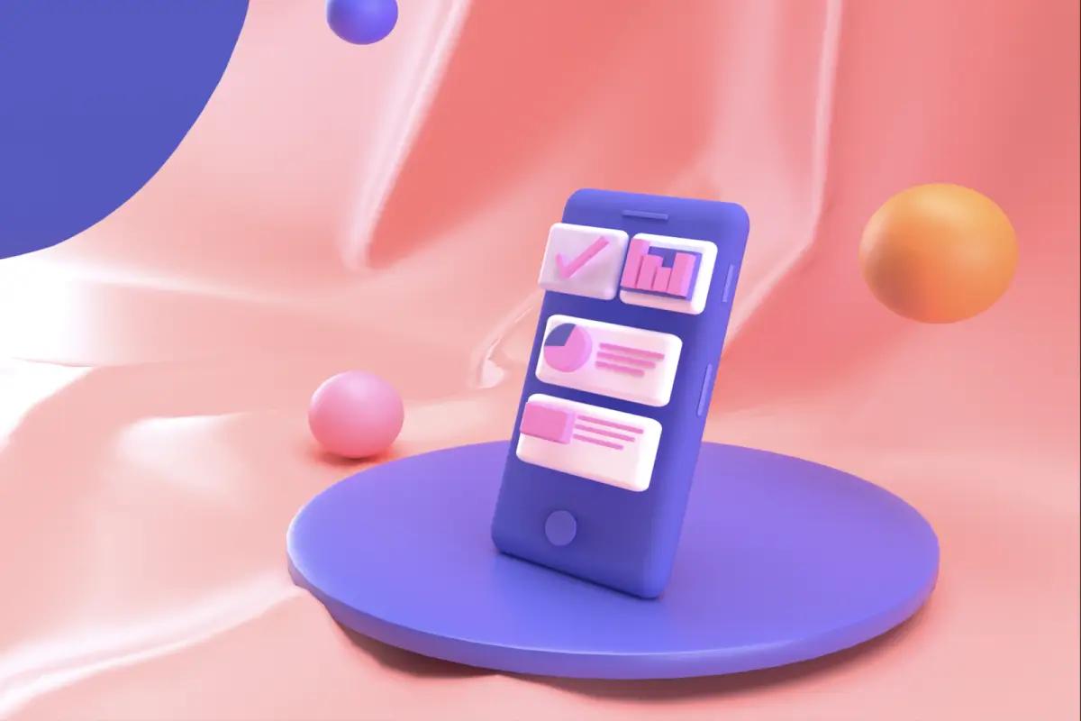
Use them for: brand personality on hero sections, depth behind cards, and guiding the eye toward a call to action.
Keep in mind: gradients eat text contrast. Check readability at every point where copy sits on top of one, and make sure the colors stay true to your brand palette instead of defaulting to the same purple-to-blue everyone else shipped that year.
6. Claymorphism: the tactile web
Claymorphism gives interface elements a soft, inflated, almost squeezable look: rounded corners, matte surfaces, and gentle inner and outer shadows. Think skeuomorphism's friendlier grandchild.
Best for: playful brands, onboarding flows, feature highlights, and call-to-action buttons that need to feel pressable.
Honest hindsight: this was the most fashion-driven entry on the list, and it dated the fastest. If you use it, keep it to accents rather than building a whole interface out of clay.
7. Minimalism: the art of less
Minimalism isn't new, but the 2024 version matured: not empty pages, but focused ones. Fewer competing elements, clearer typography, and white space doing deliberate work.
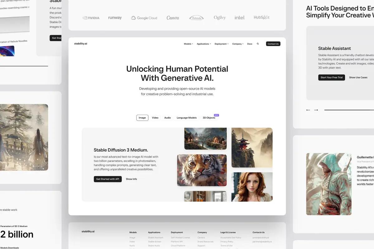
The principle that makes it work: remove obstacles, not features. Strip the page until only the things that help the visitor decide remain, then stop stripping.
White space is the engine of this whole approach; we wrote a full piece on using white space in web design.
8. Asymmetrical layouts: controlled chaos
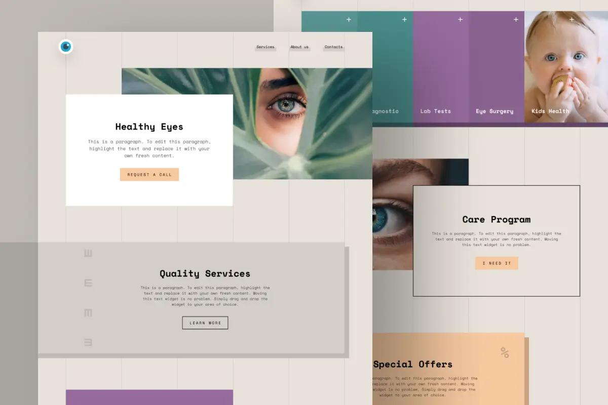
Perfectly centered, perfectly balanced pages read as templates. Asymmetry creates tension, and tension holds attention.
How to do it without making a mess:
- Start on a grid, then break it deliberately in one or two places.
- Give the page a clear focal point; asymmetry should aim the eye, not scatter it.
- Check the reading flow on mobile, where asymmetry often flattens out.
9. Modern brutalism: raw, honest design
Brutalism evolved from deliberately ugly to deliberately unpolished: raw typography, high contrast, exposed structure, and zero decorative padding.
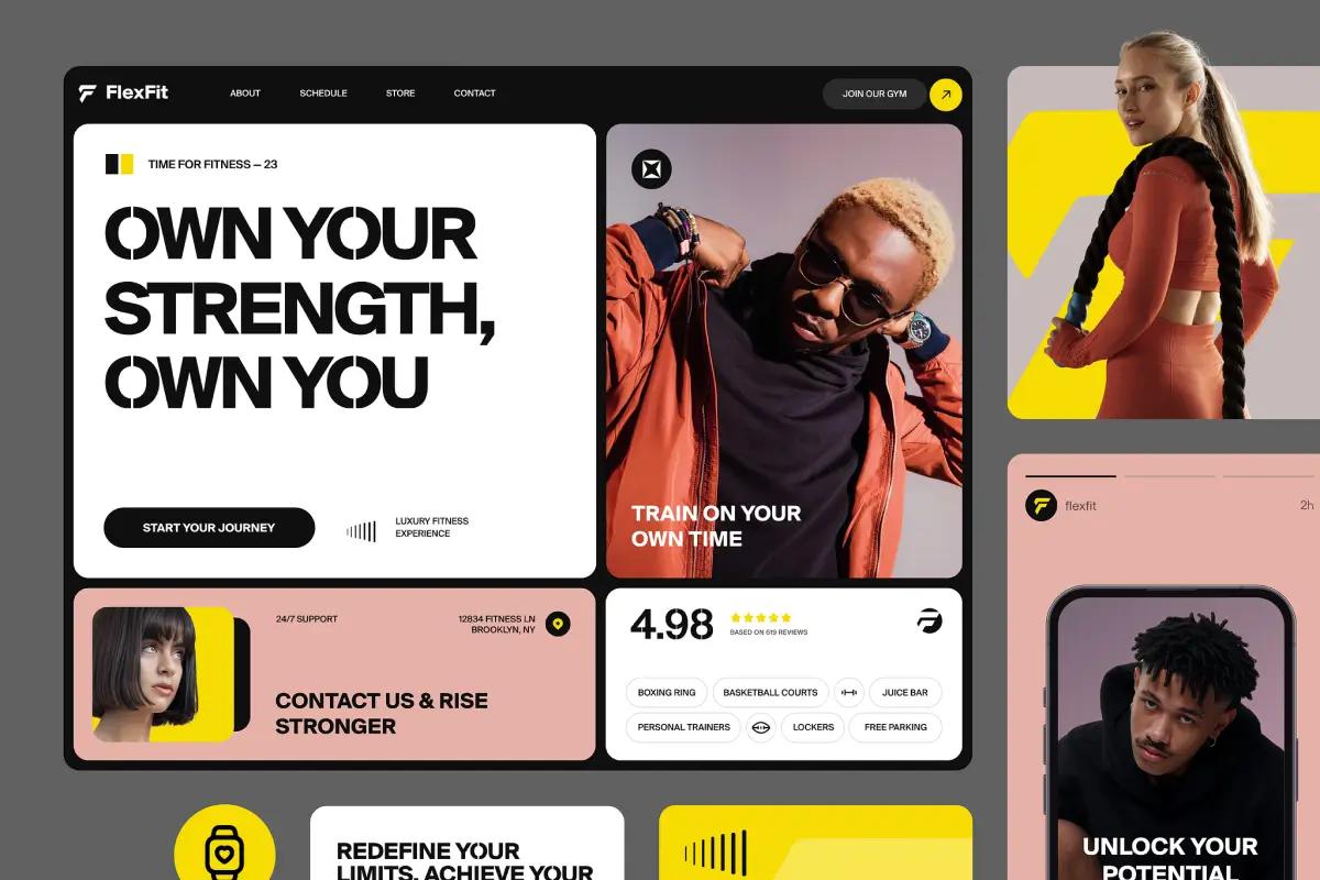
Who it works for: creative agencies, art platforms, fashion brands, and startups that want to signal confidence. It says "the work speaks for itself."
Who should skip it: anyone whose audience expects reassurance. A brutalist insurance website is a trust problem, not a statement.
10. Custom illustrations: the human touch
As AI-generated imagery flooded the web in 2024, custom illustration became a differentiator precisely because it's expensive to fake. A consistent, hand-made visual language signals that a real team cared.
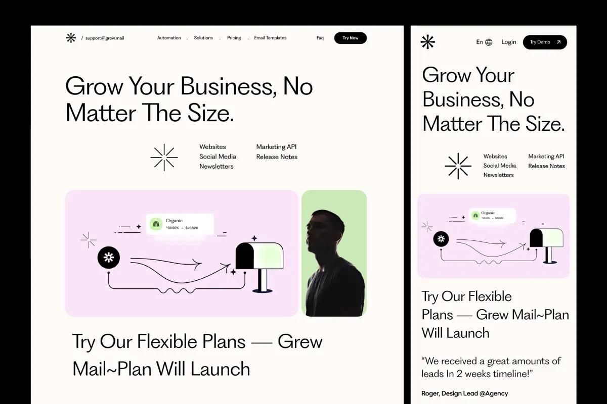
Smart places to invest: brand storytelling, explaining complex concepts, and the neglected corners of a product: error states, empty states, onboarding.
Count the real cost: illustration systems need maintenance. Every new feature needs a matching image, so pick a style your team can extend.
How to adopt a trend without wrecking your site
- Audit first. Look at your analytics, your conversion data, and real user feedback before changing anything.
- Define the objective. "Looks modern" is not a goal. "Visitors find pricing faster" is.
- Prioritize by impact versus effort. Micro-interactions and dark mode are cheap; 3D and illustration systems are not.
- Test and iterate. A/B test where traffic allows, watch the numbers, and be willing to roll back.
What survived, looking back
With a couple of years of hindsight: Bento grids, micro-interactions, dark mode, and functional minimalism became standard practice. Gradients and custom illustration settled in as styling choices. Claymorphism faded, brutalism stayed niche, and 3D kept growing wherever teams could afford the performance budget. For the trends that led into this period, see our early 2024 trends post.
The principle underneath all ten hasn't moved an inch: serve the visitor first, and the aesthetics become an advantage instead of a costume.
FAQ
Are 2024 web design trends still relevant?
The strong ones are. Bento grids, dark mode, minimalism, and micro-interactions moved from trend to baseline expectation. The fashion-driven ones, like claymorphism, have largely faded.
Should you redesign your site to follow trends?
Not for the trend's sake. Redesign when your data shows a problem, then use trends as a vocabulary of solutions. A dated site that converts beats a trendy one that doesn't.
Which trend gives the best return for the least effort?
Micro-interactions. They're cheap to add, they make a site feel responsive and cared-for, and unlike visual styles they almost never go out of fashion.