
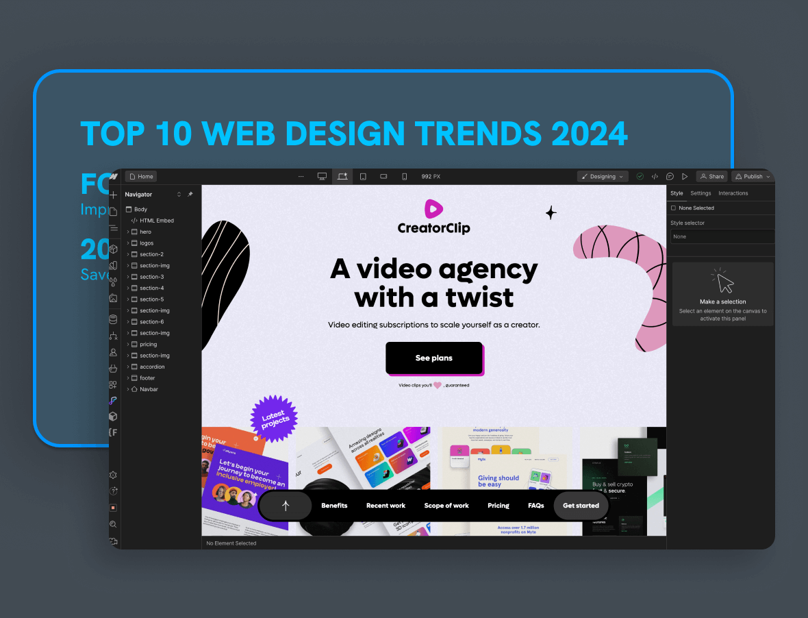
The start of 2024 was shaped by ten web design trends: Bento grids, Y2K nostalgia, accessibility as a first-class concern, dark mode, retro styling, bold color, minimalist navigation, advanced interactivity, 3D elements, and voice interfaces. This is a snapshot of that moment, kept honest: we'll tell you which of these became standard practice and which turned out to be a costume.
Reading a trends piece after the fact is actually more useful than reading it fresh. You get the ideas and the verdict. So here's the list as we saw it going into 2024, with hindsight added where it's earned.
1. Bento grids: the layout that became a default
Named after the Japanese lunch box, a Bento grid splits a page into tidy compartments of different sizes, each holding one piece of content.
Why it worked:
- It organizes dense content without making the page feel crowded.
- Card sizes create hierarchy: big box, big message.
- The modules reflow naturally on smaller screens, so responsiveness comes almost free.
Verdict: survived and thrived. Bento layouts went from trend to template, especially on SaaS feature pages. The craft now is in restraint: if every box shouts, none of them do. We dug deeper into this in our top 10 trends for 2024.
2. Y2K design: nostalgia with glitter on it
Early 2024 loved the early 2000s: sticker-like graphics, pixel fonts, chrome textures, and the naive tech optimism of the first dot-com wave.
Verdict: a fashion cycle, not a shift. It was fun for music, fashion, and youth brands, and mostly wrong for everyone else. If your audience wasn't born when Y2K happened the first time, think twice.
3. Web accessibility: the trend that became law
Calling accessibility a trend always felt a little off, and 2024 proved why. Designers were finally treating color contrast, font sizing, keyboard navigation, and screen reader support as core requirements rather than a checklist at the end.
Verdict: the most important item on this list. Accessibility kept gaining force, and regulation like the European Accessibility Act, in force since mid 2025, turned it into a legal obligation for many businesses serving EU customers. If you build on the WCAG guidelines from the start, you're ahead on usability and SEO too. We wrote a full piece on designing for accessibility.
4. Dark mode: comfort over cool
Light text on dark backgrounds was everywhere at the start of 2024, sold on sleekness and reduced eye strain.
What's actually true: many people genuinely prefer it in low light, and it can save battery on OLED screens, though research from Purdue University found the savings are modest at typical brightness levels. The practical rule hasn't changed: respect the visitor's system preference and let them switch.
Verdict: survived. Dark mode is now an expectation, not a feature.
5. Retro resurrection: warmth against the algorithm
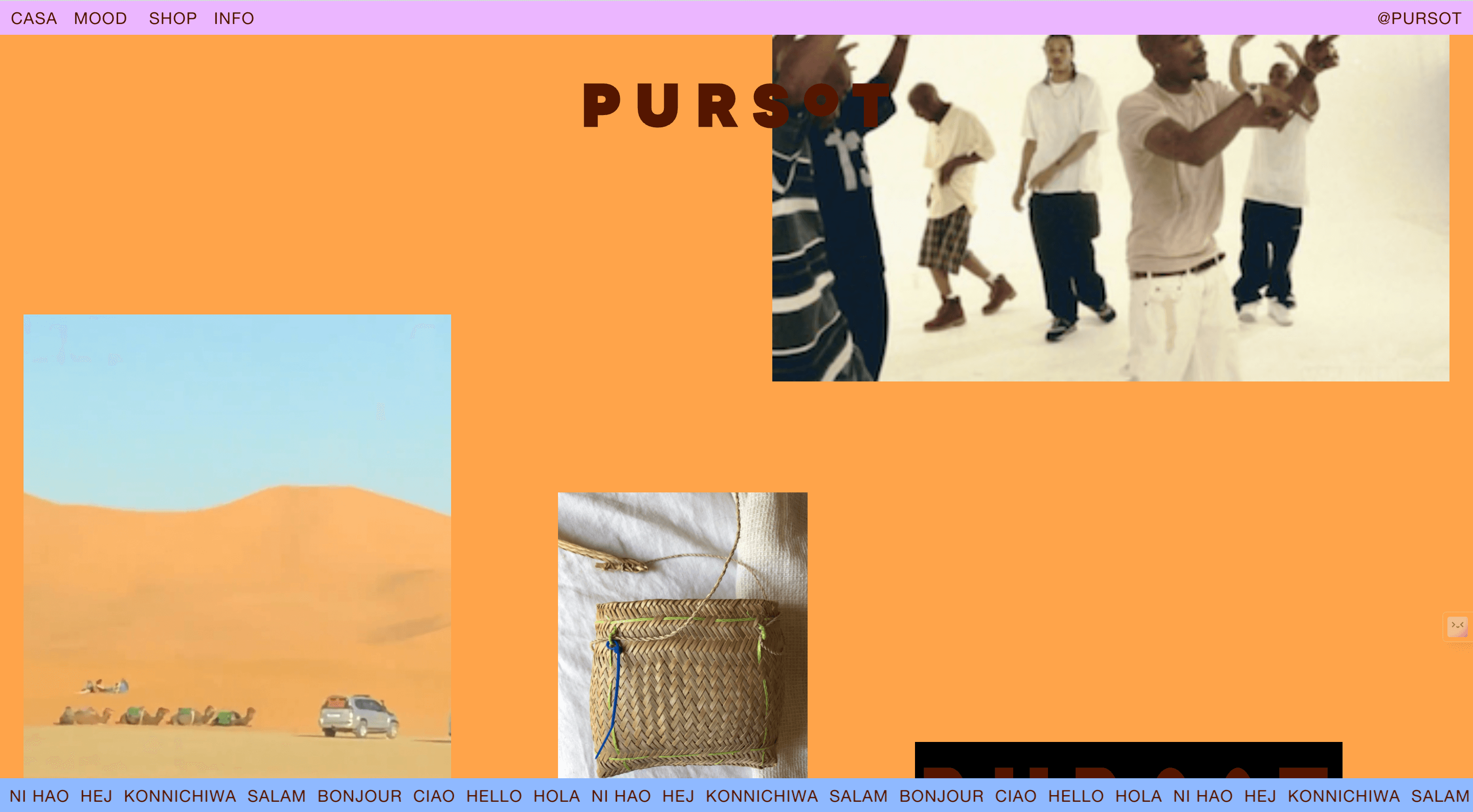
Beyond Y2K specifically, early 2024 reached back across decades: muted palettes, grainy textures, vintage typography. It was a reaction against a decade of identical minimalist sites.
Verdict: partially survived. The full retro costume faded, but the appetite for texture, grain, and human warmth stayed, and it later became a way to signal "not AI-generated."
6. Bold colors: the end of the beige internet
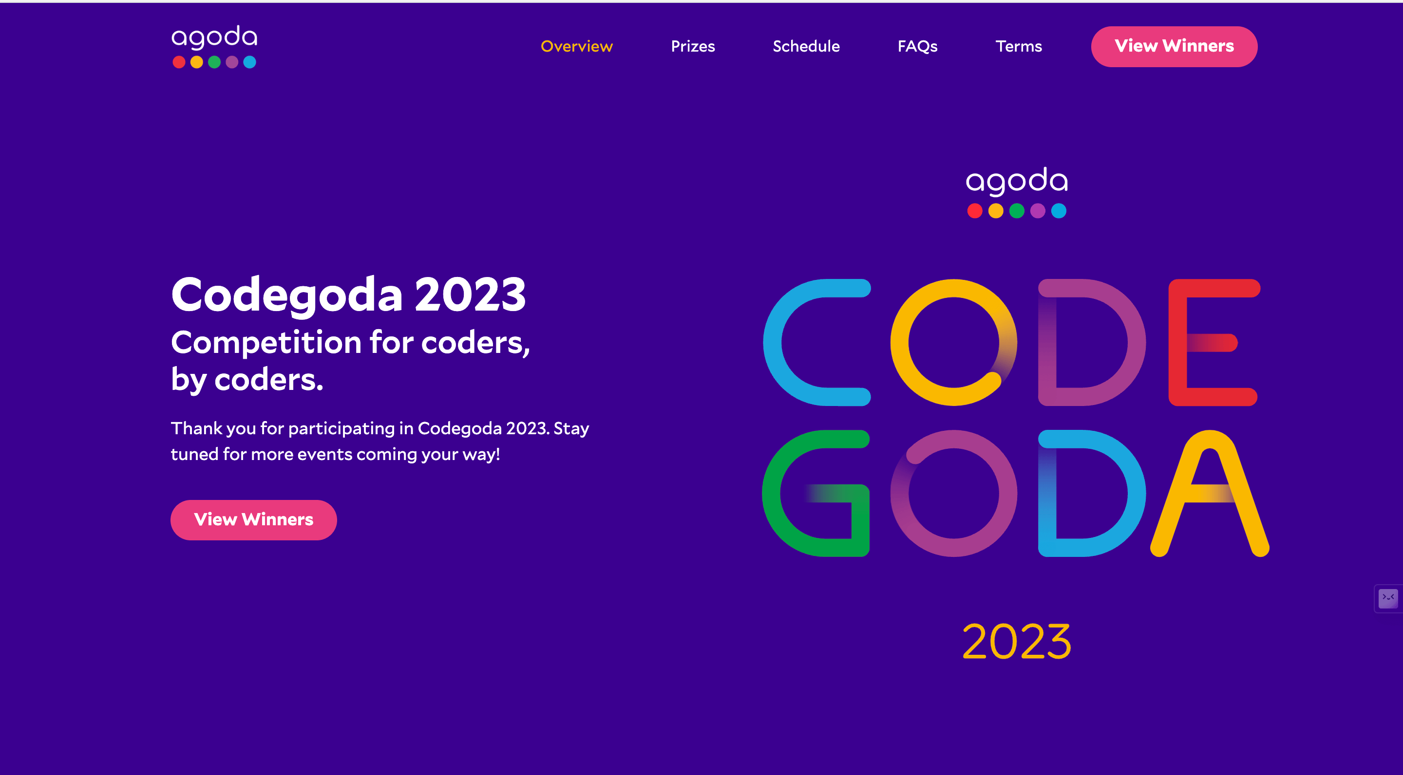
High-energy, contrasting palettes pushed out the safe neutrals. Used well, bold color creates instant hierarchy: one loud accent on a calm page tells visitors exactly where to look.
Verdict: survived as a technique rather than a style. The winning pattern wasn't rainbow pages, it was restrained palettes with one confident accent color. Color choice is psychology as much as taste; see our post on color psychology in web design.
7. Minimalist navigation: fewer doors, clearer paths
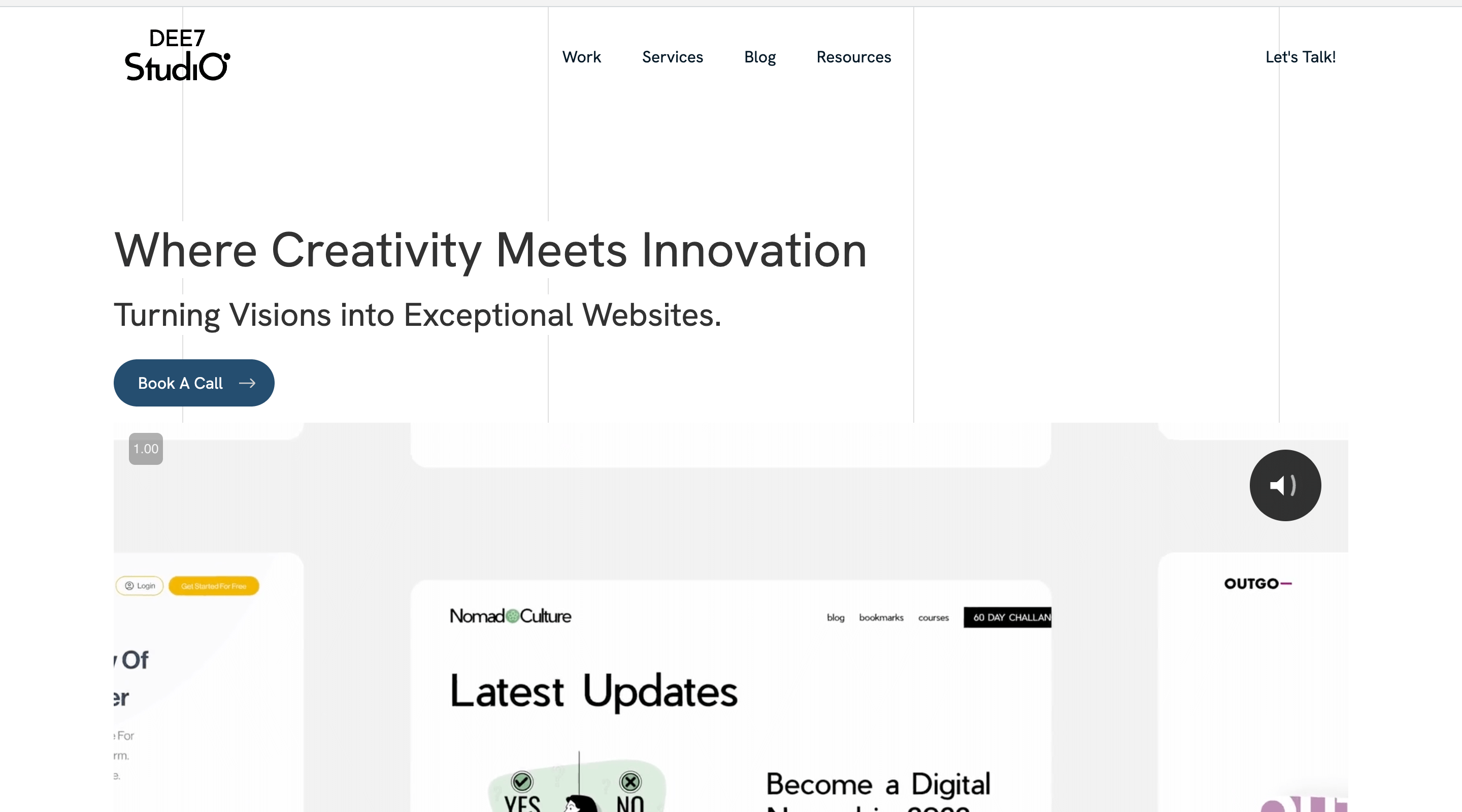
Navigation got simpler: fewer menu items, cleaner headers, more icons. The goal was to reduce decisions, not to hide things.
Verdict: survived with a caveat. Trimming a 9-item menu to 5 helps everyone. Hiding essential navigation behind a mystery icon on desktop helps no one, and that half of the trend quietly died.
8. Advanced interactivity: motion with a job to do
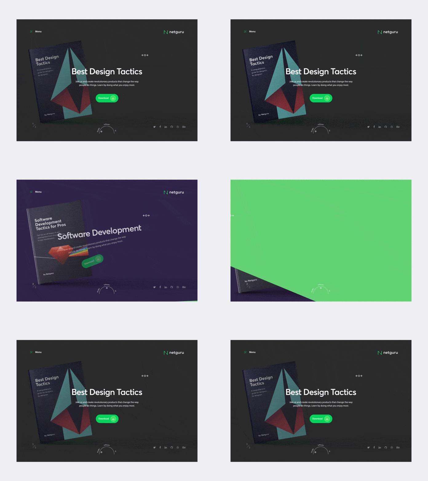
Hover effects, scroll-triggered animations, micro-interactions. Early 2024 sites felt noticeably more alive than their 2022 counterparts.
Verdict: survived wherever it served feedback and storytelling, and died wherever it was decoration that slowed the page. The test is simple: does the motion tell the visitor something? If not, cut it.
9. 3D elements: depth, at a price
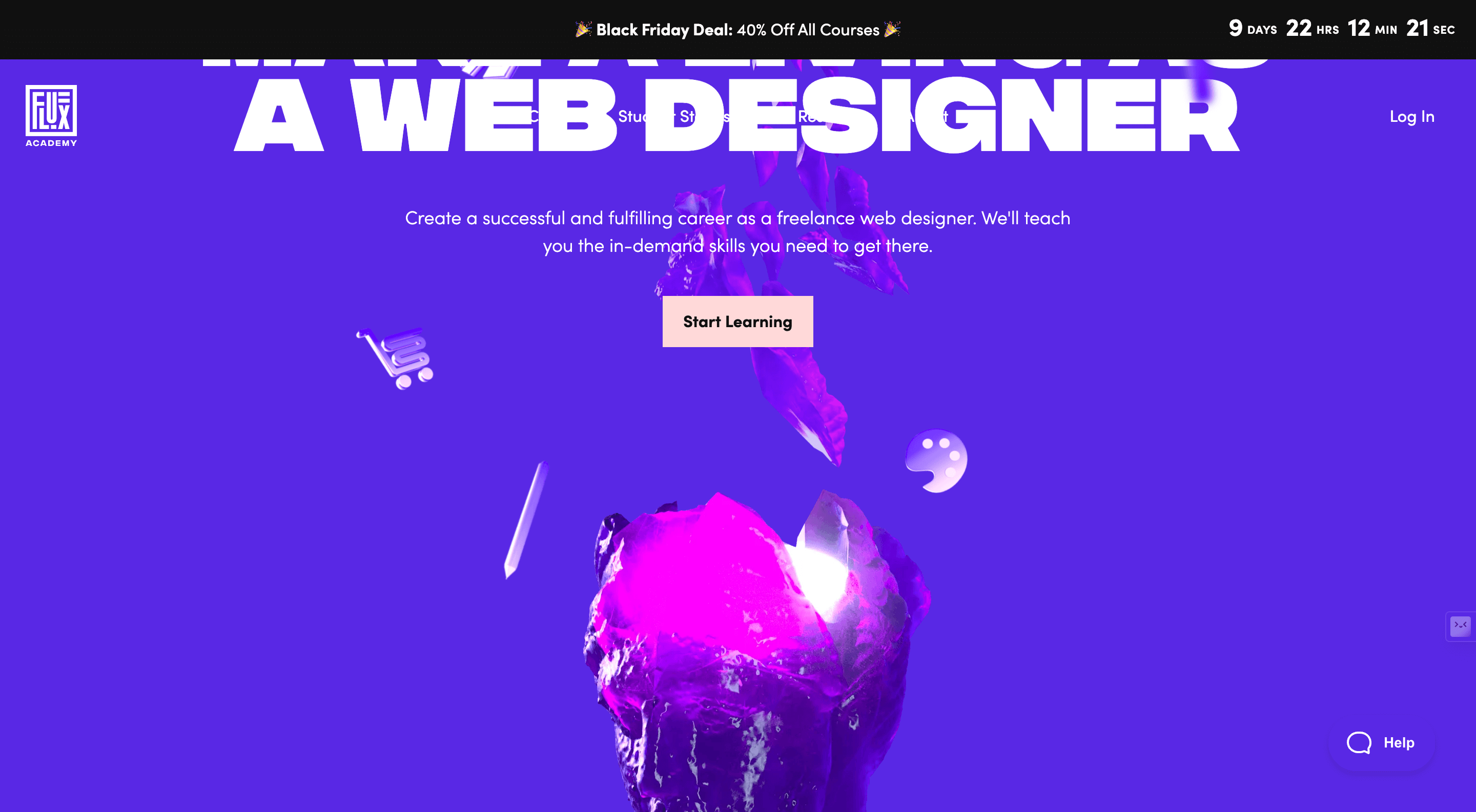
3D models, product spins, and immersive scenes made pages feel like spaces instead of documents.
Verdict: survived in a narrower lane than the hype suggested. Product showcases and brand moments, yes. Everywhere else, the performance cost rarely paid for itself.
10. Voice user interfaces: the one that didn't arrive
Going into 2024, voice navigation looked like the next frontier for website interfaces.
Verdict: didn't materialize for websites. Voice stayed in assistants and smart devices, while the web's conversational layer ended up arriving through AI chat instead. The accessibility goal behind the trend was right; the technology just took a different road.
What this snapshot teaches
Look at the pattern in the verdicts. The trends that survived (Bento grids, accessibility, dark mode, purposeful motion, restrained bold color) all solve a visitor's problem. The ones that faded (Y2K, full retro, voice on websites) were aesthetics or predictions. That's the filter to run every future trend through: does this help the person using my site, or does it just help my site look current for one season?
FAQ
Are early 2024 design trends still worth using?
The functional ones, yes. Bento grids, dark mode support, accessible design, and purposeful micro-interactions are now standard practice. The purely aesthetic ones, like Y2K styling, have cycled out.
What replaced these trends?
Mostly refinement rather than replacement. The grid-based, accessible, motion-aware foundation set in 2024 is still the base layer; later trends built on it rather than tearing it down. See our late 2024 trends guide for the next chapter.
How do you decide which trends to adopt?
Start from your data and your audience, not the trend list. Adopt what removes friction for your visitors, test it, and skip anything you can't connect to a measurable goal.